

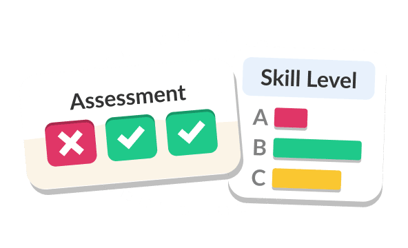
All the Help You Need
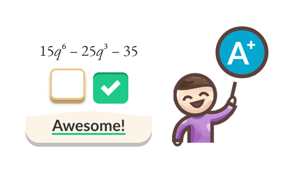
Lessons and practice problems for any topic.
Elementary
Kindergarten through 7th math plus Pre-Algebra, aligned to state standards.
High School
8th–12th math including Algebra, Geometry, Trigonometry, Precalculus, and Statistics with SAT/AP test prep.
University
College Algebra, Calculus 1–3, Statistics, College Statistics, Differential Calculus, Business Calculus, Multivariable Calculus, Differential Equations, Linear Algebra, and Economics.
K–6
“Build strong foundational skills and remove early math anxiety.”
7th & Pre-Algebra
“Bridge the gap before high school and prevent confidence drop-off.”
Elementary
K–6
“Build strong foundational skills and remove early math anxiety.”
7th & Pre-Algebra
“Bridge the gap before high school and prevent confidence drop-off.”
High School
K–6
“Build strong foundational skills and remove early math anxiety.”
7th & Pre-Algebra
“Bridge the gap before high school and prevent confidence drop-off.”
University
K–6
“Build strong foundational skills and remove early math anxiety.”
7th & Pre-Algebra
“Bridge the gap before high school and prevent confidence drop-off.”


Questions?
Quick answers about StudyPug
Why will StudyPug work for me?
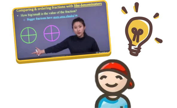
On-demand access to short, focused videos covering your entire curriculum. Work at your own pace, find any topic instantly.
Who can sign up?
Everyone! High school, university, test prep—we've got you covered.
Is payment secure?
Yes. All transactions use SSL encryption.
How do I find topics?
Use search or browse by subject and grade level.