Reading and Drawing Histograms: Essential Data Visualization Skills
Unlock the power of data analysis with our comprehensive guide on reading and creating histograms. Learn to interpret shapes, identify patterns, and effectively visualize continuous data distributions.

  1. Intros0/2 watched
  2. Examples0/10 watched
  1. 0/2
  2. 0/10
Now Playing:Read and draw histograms – Example 0a
Intros
0/2 watched
  1. Introduction to Histograms
  2. How to read a histogram?
  3. How to make a histogram?
Examples
0/10 watched
  1. The histogram shows the volume of fluid George drank each day.
    Reading and drawing histograms
    1. For how many days did George drink 2.0-2.9 cups of water?

    2. Are there more days that George drank 4.0-4.9 cups or days that George drank 6.0 to 6.9 cups?

    3. What is the shape of distribution?

Reading and drawing bar graphs
Notes
Concept

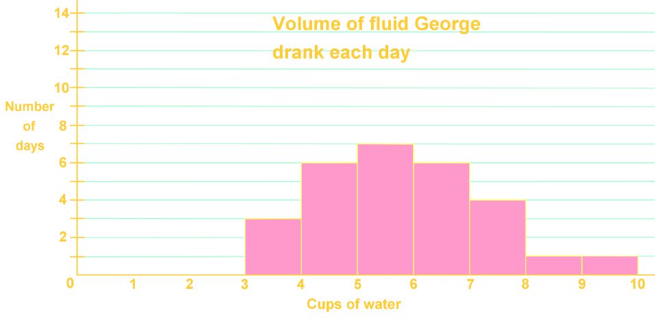
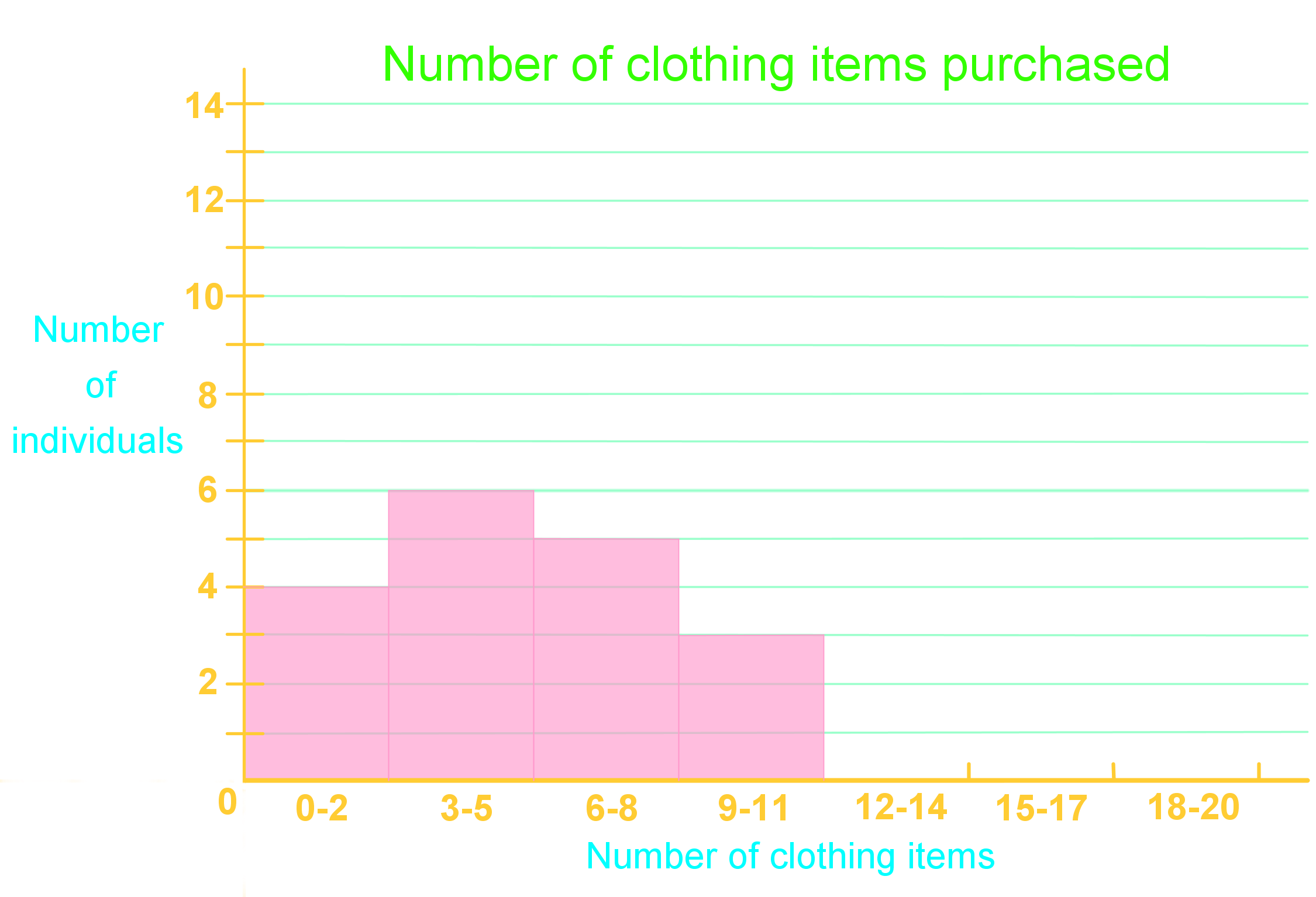
Introduction to Reading and Drawing Histograms

Histograms are powerful tools in data visualization, essential for representing continuous data distributions. Unlike bar graphs, which display discrete categories, histograms showcase the frequency of data points within specific intervals or bins. This unique feature makes histograms invaluable for analyzing patterns, identifying outliers, and understanding the shape of data distributions. In our introduction video, we'll explore the fundamentals of histograms and their significance in data analysis. You'll learn how to interpret histogram shapes, such as normal distribution histogram, skewed, or bimodal distributions, and how these shapes reveal crucial information about your dataset. We'll also discuss the key differences between histograms and bar graphs, emphasizing how histograms excel at representing continuous data like heights, weights, or temperatures. By mastering histograms, you'll gain a vital skill for effectively communicating complex data trends and making informed decisions based on data distributions.

Example

The histogram shows the volume of fluid George drank each day.
Reading and drawing histograms
For how many days did George drink 2.0-2.9 cups of water?

Step 1: Understanding the Histogram

A histogram is a type of bar graph that represents the frequency of data within certain intervals or ranges. In this case, the histogram shows the volume of fluid George drank each day. The x-axis represents the intervals of cups of water consumed, while the y-axis represents the frequency, or the number of days George drank that amount of water.

Step 2: Identifying the Relevant Interval

To determine how many days George drank between 2.0 and 2.9 cups of water, we need to locate this interval on the x-axis of the histogram. The x-axis is divided into intervals, also known as buckets, which in this case represent ranges of cups of water consumed.

Step 3: Locating the Interval on the X-Axis

On the x-axis, find the interval that includes 2.0 to 2.9 cups of water. This interval is typically marked between the numbers 2 and 3 on the x-axis. This is the bucket we are interested in for this question.

Step 4: Checking the Frequency

Once the interval is located, we need to check the height of the bar corresponding to this interval. The height of the bar represents the frequency, or the number of days George drank between 2.0 and 2.9 cups of water. In this case, we observe that there is no bar (or the bar is at height zero) in the interval between 2.0 and 2.9 cups.

Step 5: Interpreting the Data

Since there is no bar present in the interval between 2.0 and 2.9 cups of water, it indicates that the frequency is zero. This means that George did not drink between 2.0 and 2.9 cups of water on any day.

Step 6: Conclusion

Based on the histogram, we can conclude that George drank between 2.0 and 2.9 cups of water on zero days. This is determined by observing the absence of a bar in the specified interval on the histogram.

FAQs
  1. What is the difference between a histogram and a bar graph?

    A histogram represents continuous data in adjacent bars, while a bar graph displays discrete categories with gaps between bars. Histograms show frequency distributions of data within intervals, whereas bar graphs compare distinct groups or categories.

  2. How do I choose the right number of bins for a histogram?

    The number of bins can be determined using various methods, such as the square root of the total data points or Sturges' formula. A general rule is to use enough bins to show the data's shape without introducing too much noise. Start with 5-20 bins and adjust based on your data's characteristics and the insights you want to highlight.

  3. What can the shape of a histogram tell us about the data?

    The shape of a histogram reveals important characteristics of the data distribution. A symmetrical shape suggests a normal distribution, while skewed shapes indicate more data on one side. Bimodal distributions (two peaks) suggest two subgroups within the data. The overall shape can indicate central tendency, spread, and potential outliers.

  4. How do I interpret outliers in a histogram?

    Outliers in a histogram appear as isolated bars far from the main distribution. They represent data points that are significantly different from the rest. While outliers can sometimes indicate errors, they may also reveal important extreme cases. Always investigate outliers to understand their cause and potential impact on your analysis.

  5. Can histograms be used for comparing multiple datasets?

    Yes, histograms are excellent for comparing multiple datasets. You can overlay histograms, use side-by-side comparisons, or create back-to-back histograms. When comparing, ensure consistent bin sizes and scales across all datasets. This allows for visual assessment of differences in central tendency, spread, and overall distribution shape between groups.

Prerequisites

Understanding the foundation of a subject is crucial for mastering more complex concepts. When it comes to reading and drawing histograms, two key prerequisite topics play a vital role in building a solid understanding: the relationship between two variables and probability.

The concept of relationships between variables is fundamental to grasping histograms. Histograms are graphical representations that display the distribution of numerical data, showing how frequently different values occur within a dataset. By understanding how variables relate to each other, students can better interpret the information presented in histograms. This knowledge helps in identifying patterns, trends, and outliers within the data.

One key aspect of understanding variable relationships is recognizing the differences between histograms and bar graphs. While both are visual representations of data, they serve different purposes and are used in distinct contexts. Histograms are used for continuous data, whereas bar graphs are typically used for categorical data. This distinction is crucial when deciding which type of graph to use for a given dataset.

Probability, another essential prerequisite, forms the backbone of statistical analysis and is closely tied to histogram interpretation. When reading histograms, students often encounter concepts related to probability distributions. Understanding basic probability principles helps in making sense of the frequency distributions displayed in histograms. It allows students to make informed predictions and draw meaningful conclusions from the data presented.

A key skill in working with histograms is creating frequency tables, which is directly related to probability concepts. Frequency tables are often the first step in constructing histograms, as they organize raw data into manageable groups or intervals. This process requires an understanding of how to calculate probabilities and relative frequencies, which are fundamental probability concepts.

By mastering these prerequisite topics, students can approach histograms with confidence. They will be better equipped to interpret the shape of distributions, identify central tendencies, and understand the spread of data. This knowledge is not only crucial for academic success but also has practical applications in various fields, including science, economics, and data analysis.

In conclusion, a solid grasp of the relationship between variables and probability provides the necessary foundation for effectively reading and drawing histograms. These prerequisite topics enable students to understand the context, interpret the data accurately, and draw meaningful conclusions from histogram representations. As students progress in their studies, they will find that this foundational knowledge continues to be relevant and applicable in more advanced statistical concepts and data visualization techniques.