Frequency distributions and histograms
Now that you have learned the basic concepts on the classification of data, know how to obtain the data through sampling methods; and understand the errors that data may contain, it is time we focus on using data! For that, you first have to understand what frequency is in statistics.
What does frequency mean?
So, what is frequency? You may have heard about frequency before on a physics lesson; in general, frequency refers to the amount of times an event repeats per a unit of time. In physics this is usually defined as cycles of an event per every second, producing the unit of frequency called Hertz, which is based on the repetition of crests from a moving waveform.
For statistical purposes, the basic meaning of frequency remains but the units change. Not having a particular time frame, frequency statistics care about defining the incidences of an event during the statistical study (such as a survey).
In simple terms, frequency provides us with the amount of times a particular variable outcome appears throughout our study, and this outcome can be anything!; therefore, you will usually have more than one of these variables. Let us look take a look at the next example:
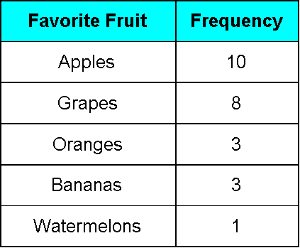
Imagine a teacher asks the students in her classroom to name their favorite fruit, and from a classroom of 25 people the next result was obtained: 10 people prefer apples, 8 people prefer grapes, 3 people prefer oranges, 3 people prefer bananas and one person prefers watermelons.
From this data, the variable is the favorite fruit of each person and the outcomes are: apples, grapes, oranges, bananas and watermelon; then, frequency of each outcome is: apples have a frequency of 10, grapes have a frequency of 8, oranges and bananas each have a frequency of 3, and watermelons have a frequency of 1. You see how easy is to obtain the cumulative frequency of a data set? We can even express these in a frequency table:
What is a frequency distribution?
So, you have gathered data for a statistical study, now, what can you do with it?
In order to obtain a statistical result you need to organize the collected data in someway that allows you to infer a result, that is where frequency distributions come to place. A frequency distribution is a tool to organize the gathered information into an efficient model; such model will allow the statician to identify patterns, trends or tendencies quickly from the data. Thus, a frequency distribution can be a table (just as the one shown in figure 1), a chart, a graph or even a simple list! Its level of difficulty depends on the amount of data collected in the study, and the amount of variables being observed or questioned.
To put the frequency distribution definition into more mathematical terms, frequency distribution is a way to orderly sort data based on the magnitude of the observations. Its a visual way to summarize and present data effectively. The three main ways in which we depict frequency distributions are in a frequency distribution table, through histograms and through bar graphs.
The simplest of these visual data representations is the table depiction, an example of it has been shown in figure 1; now, let us take a look at the concepts and terms you need to know when working on frequency distribution tables.
Taking figure 1 as reference, the first thing we notice is that the variable of the study in that case was divided in different options representing the outcomes from the question what is your favorite fruit?. We know that the variable is favorite fruit of each person, and so, the outcomes determine the classes that have to be portrayed in the distribution table. In other words, observations are usually classified into groups called classes or a class interval, since the survey represented in figure 1 is very simple, each class is named after a single outcome from the survey. Thus, the classes in figure 1 are: apples, grapes, oranges, bananas and watermelons.
Classes are very useful when dealing with large amounts of data since you can divide the data by groups within certain limits and each group will be a class, instead of naming a class after each possible outcome from the survey in your distribution table. That is the reason why classes can be called class intervals, because you can literally classify the data outcomes into intervals (ranges), and portray the frequency of each interval on the table instead of having a huge amount of classes named after every single different outcome. Dividing large amounts of data into intervals allows the researcher to avoid producing an immense table (with a huge amount of rows) which would be difficult to interpret quickly.
For example, a young clerk is in charge of distributing the limited parking spots in the lot for his office building, and for that reason, he is surveying his whole companys office to see the people who own a car. Given that more than likely there will not be enough spots for everyone, the spots will be distributed by seniority in the company (so people who have the most years working in there, have a priority to obtain a parking spot). After asking about car ownership to the people in his company, 135 of them reported owning a car, and the complete data gathered is shown below:
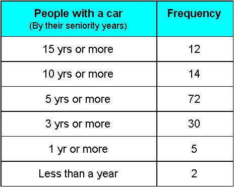
Notice the variable in question for this data is people with a car, which is a discrete variable, while the classes are based on the seniority each person has among the company: Either they have been in the company for less than a year, more than a year, more than 3 years, more than 5 years, more than 10 years and/or more than 15 years.
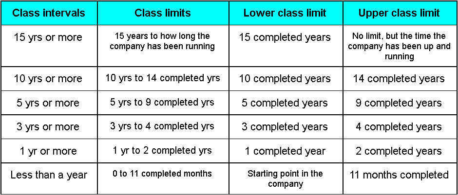
This time, the classes happen to be intervals instead of a single item, we could have done classes for each year of seniority but it would have required a much larger table; thus, you can see in figure 2 that each class interval has limits or endpoints. Class limits refer to the smallest and largest possible values in a class. For example, if the smallest number in a class was 5 and the largest was a 25, then the class limits are 5 and 25. In this case, 5 is called the lower class limit and the 25 is the upper class limit. In the same way, looking at figure 2 we can conclude that the class limits for each class go as follows:
When further numerical data has to be collected from a frequency distribution table with extensive interval classes, one can always obtain the midpoint of the classes. The midpoint of each class is the mid value of the class and it can be found with the formula:
We can also talk about the magnitude of a class interval, which is the difference between the lower and upper limit of a class. For our previous example, let us look at the class where the seniority goes from 10 to 14 completed years in the company; for this case, the magnitude of the class is 4. The magnitude of an interval class can also be called the width, or the length of the class interval.
And finally, the class frequency is the number of times an observation of an event happens in a class interval, the number of outcomes (basically the numbers in the right column of figure 2). Keeping the these terms in mind, one can properly explain different aspects of a frequency distribution table.
Besides looking at the classes of the data collected, it is interesting to see the other kind of information one can infer from the frequency distribution table in figure 2. Take a look at the numbers, and then think on the scenarios: There is a lower amount of people with a car in the two highest classes of seniority, is it because they dont like cars? Is it because they just didnt answer the survey truthfully, or the most probably option: maybe that the company itself, although already in the works for more than a decade, it has few personel older than 10 or 15 yrs working on it because a company takes time to take off; therefore, only the founder members have been there that long. So you can identify members who have been building blocks of the company.
On the other hand, the people on the class intervals with lower seniority reported even a lower incidence of car ownership. This is understandable, the people in these categories may be new graduates, new professionals entering the workforce; these people might be a few steps away to establish themselves and have the means to own a car, a lot may be using public transportation, etc. Also, people starting up in the company may not be a big group, and so, even if all of them have cars, the incidence reported will be low.
This is how frequency distributions are an important tool in statistics, because they allow you to see even further from the data that has been collected. A statistician can establish new theories, questions, and variables of interest to continue studying a population. Many times the data collected had a purpose and ends up serving many others, and that, as a whole, is the beauty of statistics and what you are starting to learn on this course.
What is a histogram?
A frequency distribution graph usually has one of two forms: either a histogram or a bar chart.
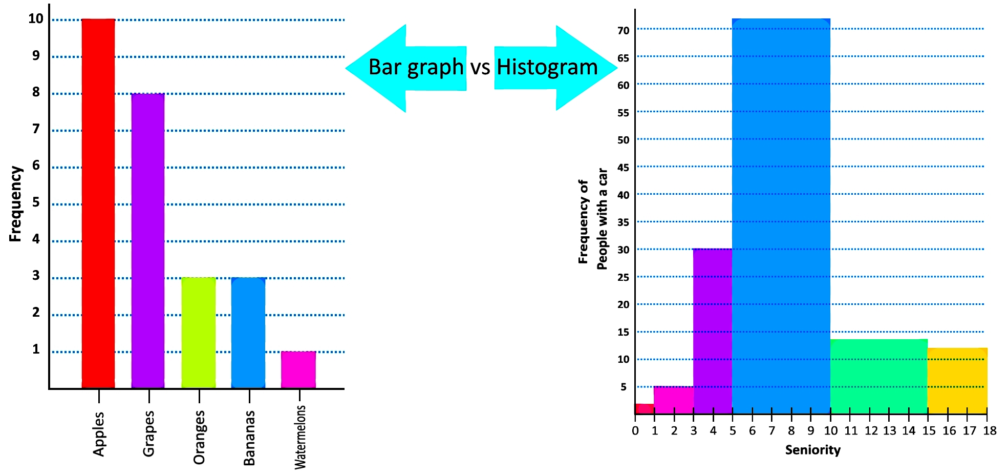
A histogram is the most basic graphic representation of a frequency distribution, it is usually confused with a bar graph since both of them represent quantities using rectangles (or bars). There are many differences between both, the histogram and the bar chart, the two most important ones being that histograms are used to represent the frequency distribution of a variable only, while a bar graph can be used to relate many variables together (usually more than one); the second difference (and probably the easiest to remember) is that histograms are used to represent ranges of class intervals (in other words numbers of continuous data such as the seniority ranges in figure 2), while bar graphs are used to represent classes of one outcome (categories, such as those represented in the table from figure 1); for that matter, a bar chart happens to be conformed by bars which are separated from each other, while the histogram rectangles are all adjacent to one another to show the flow of continuous data.
Therefore, we define histogram as the graphic representation of a frequency distribution of one variable, where each bar or rectangle in the graph represents the frequencies of consecutive ranges from class intervals in a frequency distribution table. The adjacence of the bars in the histogram show how the values of the classes being represented are non-overlapping, but continuous (there is no gap between them, as mentioned before, they are consecutive) in order to not miss any data from a class interval. The only way how a histograms bars may have a gap in between them, is when a class interval has a frequency of zero, while the surrounding classes have higher frequencies. One can also make a relative frequency histogram by representing the percentage values of relative frequency on the histogram bars instead of the frequency values.
Next, we have the comparison between a bar graph and a histogram using the frequency distributions found in figures 1 and 2. We will have more histogram examples in the last section of this lesson.
Histograms can be used to create frequency polygons and give a quick look into the cumulative frequency distribution of the data. We will talk about this in more detail on our next lesson, for now, it is important you understand the basics on how to make a histogram, understand the resulting histogram shapes and know the differences on the comparison of a histogram vs bar graph.
How to construct a frequency distribution:
On this section, we will focus on the process to construct a frequency distribution table and its corresponding histogram graph, on each histogram example, take a look at the differences between a bar graph and a histogram, so you do not confuse them when working independently.
Example 1
Listed below are the heights of a class of 7th graders: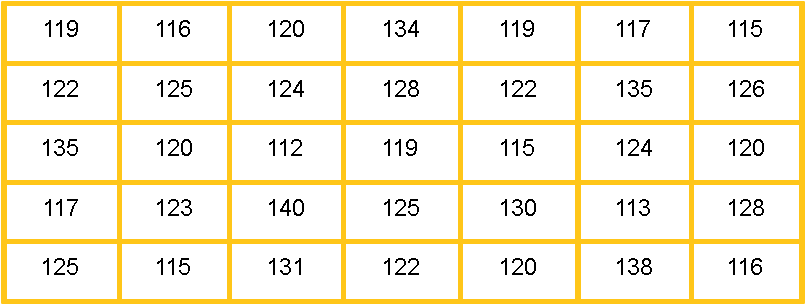
Before we build the frequency distribution table, let us look at the concepts of parts c) and d) which we have not defined before:
When talking about the relative frequency distribution, we talk about the frequency counts portrayed in a distribution table being transformed into their appropriate percentages from the whole. Just take a look at the resulting frequency distribution table in figure 6, notice in the third column from the left, that the relative frequency just refers to the equivalent percentage (out of the total frequency) for the counts noted in the frequency column.
Are you not sure on how to find relative frequency percentages? No problem, the formula is very simple:
Now, how to find the cumulative frequency? That is actually a very simple task. We define cumulative as the add up of a certain quantity; the successive addition of the quantities resulting from a particular variable; hence, the only thing you need to do is to add all of the frequency incidences of the classes above the class in question, with the frequency of that class. Consequently, the last row of the table will show a final cumulative frequency that must be equal to the addition of all the outcomes frequencies occurred during the count (the total frequency of the statistical study). And so, to answer part d of this example question, look at the fourth column from left to right in the resulting table:
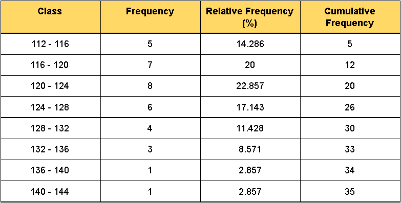
Notice from figure 6 that the limits of the class intervals overlap, something we hadnt shown before. For example, in our first class interval (shown on the first column of the table) we can see the lower limit being 112, and the upper limit being 116; then, in the second class interval the lower limit is 16 and the upper limit is 120. Can we do that? Yes!
So far we have been looking at examples using the inclusive method where both of the limits of each class are included within the class in question; given that the condition for this problem asks us to set class width as 4 and lower limits of the classes as multiples of 4 we cannot use the inclusive method here, and so we make use of the exclusive method.
On the exclusive method for constructing classes of frequency distributions, we allow the upper limit of each class to be the lower limit of the class that follows; it is important to note this is only for frequency distribution table notation, when counting the frequency of each outcome, any outcome with a value equal to the upper limit of a class will be counted ONLY as part of the class where this value is the lower limit. For example, for the data provided in figure 5 and then put into the table in figure 6, a count with a value of 116 is included in the frequency count of the class where 116 is the lower limit ONLY (second class in figure 6); in the same way, a count with a value of 120, is only counted in the frequency of the class where 120 is the lower limit (third class in figure 6); and so on, in that way, we make sure that the condition demanded in section a) of this problem is met.
For further explanation on the inclusive and exclusive methods, you can read all about it in the next article called methods of constructing a frequency distribution.
Now let us continue with the second part of this problem:
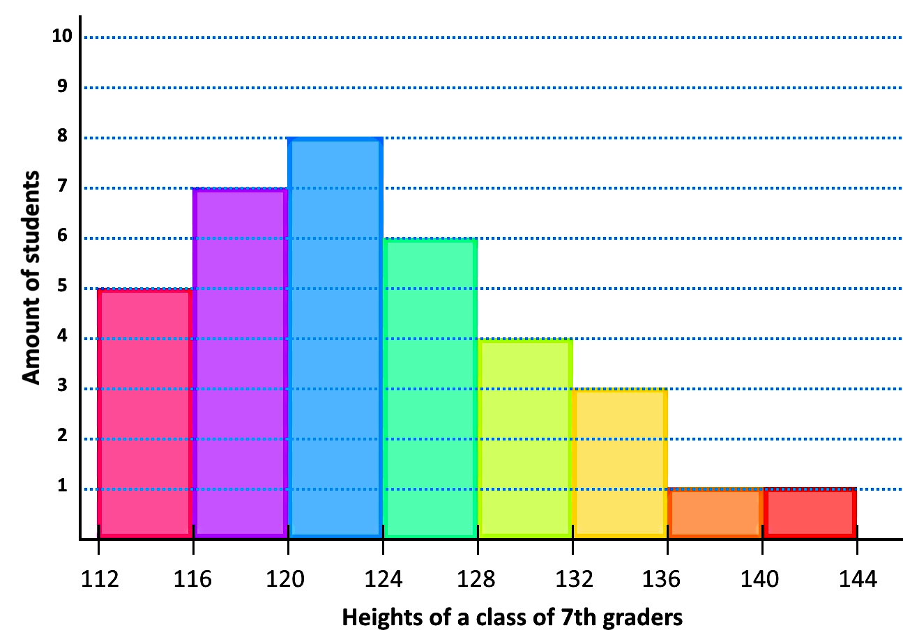
And so, the resulting histogram looks like:
Example 2
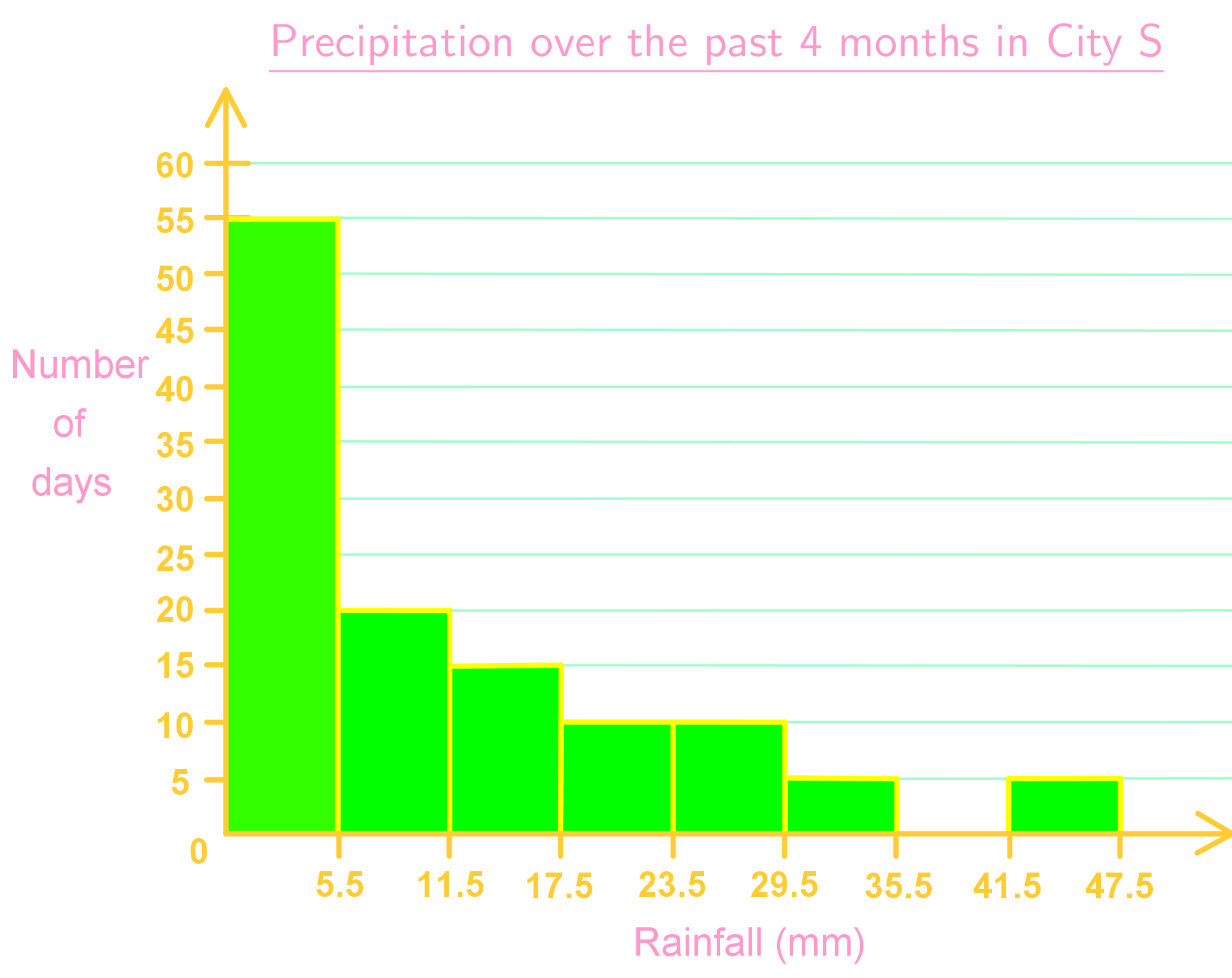
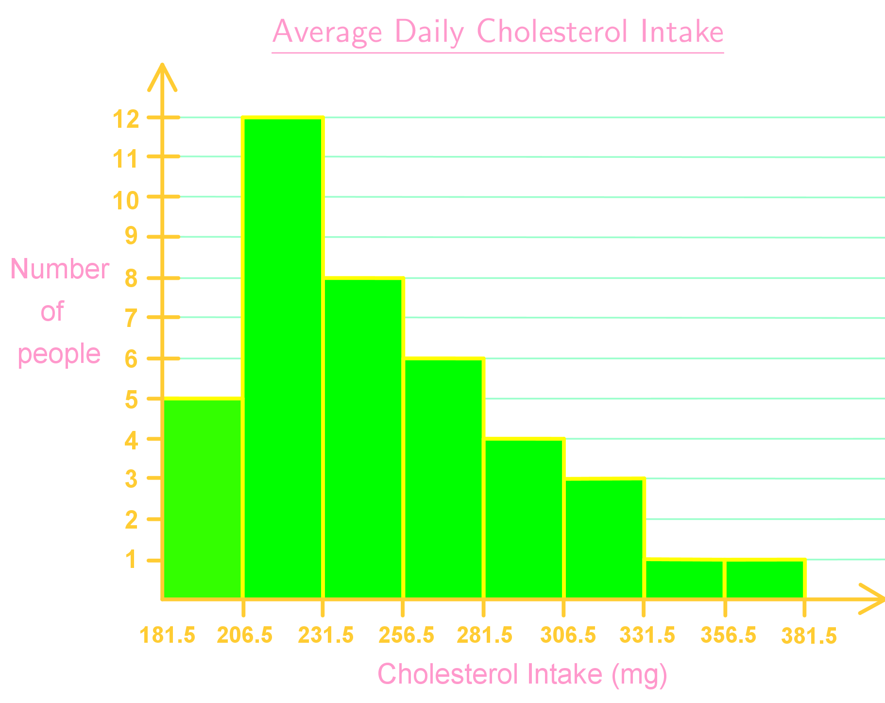
On this example, let us take a look on how to read a histogram and then answer the questions based on the histogram below.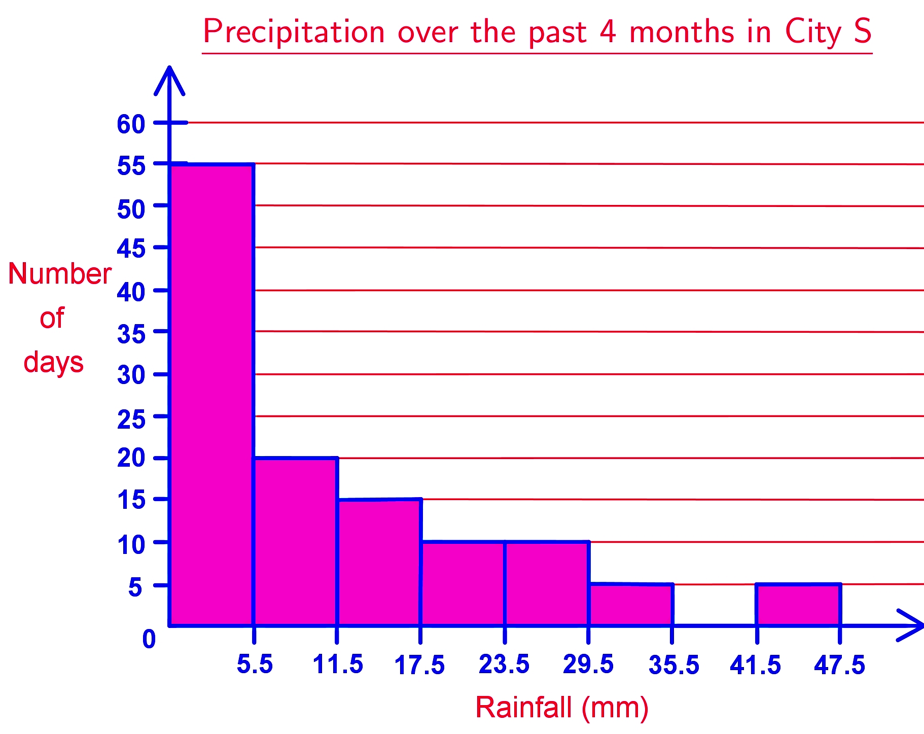
- How many days had more than 35.5 mm of rainfall? 5 days
- How many more days had 11.5 to 17.5 mm of rainfall than between 35.5 to 47.5 mm of rainfall? There were 10 days more hat had between 11.5 and 17.5 mm of rainfall, than those which had between 35.5 and 47.5 mm of rainfall.
- What is the relative frequency of having 17.5 to 23.5 mm of rainfall? There are 10 days which had from 17.5 to 23.5 mm of rainfall, and counting all of the days from all the columns in the graph, we can see that there were a total of 120 days of rainfall. Thus, following equation 2, we have that:
And so, the relative frequency of having between 17.5 and 23.5mm of rainfall is 8.3%.
After looking at a few problem examples with frequency distribution tables and histograms, we finalize this lesson by recommending you to visit the links on this paragraph, the first one is a very informative page by Statistics Canada; also, this article on statistical language. Both links can be useful while you continue with your independent studies on this lessons topic.

