Shapes of distributions
We learned from our lesson on the frequency distribution and histograms, that a frequency distribution is a tool to organize the gathered information from a statistical study into an efficient model, where data are summarized and depicted in a manner that facilitates its communication. A frequency distribution orderly sorts data based on the magnitude of the observations, it accounts for the total outcomes of a survey or experiment, and presents the frequency of each outcome as it has been observed or obtained; Then, the presentation of the data is done through a frequency distribution table, a histogram or even a frequency polygon.
But data is not only depicted through frequency distributions and their many graphic methods, data can also be presented through probability distributions.
Before we cover this new concept, let us remember that in general (in statistics) a distribution refers to the way data collected is presented (a graphic representation of a data set), in other words, a distribution is the way a data set has been arranged to show the spread of its values : the range the values have, how dispersed are they from each other, or close, etc. Usually a distribution is either a frequency distribution or a probability distribution, and the type of distribution depends on the basis of the arrangement (the basis taken to graph or depict the data in any way). While a frequency distribution depicts the data based on the specific outcomes obtained from the study or experiment, the probability distribution will base its depiction on the chances of each possible outcome to happen.
In simple words, a probability distribution is yet another graphic representation of the values in a data set, the difference is that a probability distribution graph provides the probability of each specific outcome to occur, rather than its frequency. Therefore, the vertical axis in a histogram or frequency polygon is the frequency of each events outcome in the study, while the vertical axis in a probability distribution graph is the probability of the outcomes happening.
On this lesson, we will be focusing on studying data distribution shapes and learning to identify the information that can be obtained just by looking to the shape of the distribution being studied.
How to determine the shape of a distribution
We will go into detail about the probability distribution in a later lesson, for now we will focus on the topic of shape of distribution statistics, no matter what type of distribution you are working with.
Let us learn how to determine the shape of distribution by looking at the basic figures one can find through different graphic representations of data:
• Symmetric

There are two main types of symmetric distributions, they can either be bell-shaped or u-shaped.
• Bell Shaped
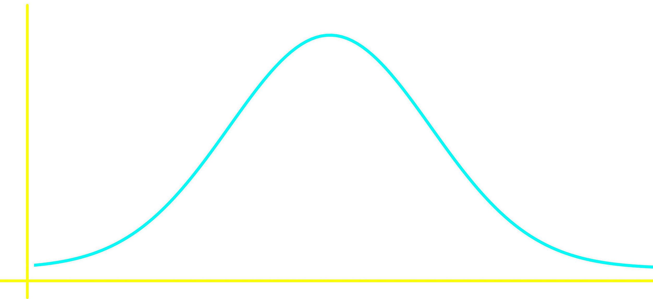
Bell shaped distributions are what is known in math and science as a normal (or Gaussian) distribution; they are the most important probability distribution shape since it is usually the product of a sufficiently large data set from random variables found in nature. We will talk about it more after we have a deeper understanding on what a probability distribution is in later lessons.
In general, a bell shaped distribution (also called a mound shaped distribution) looks like:
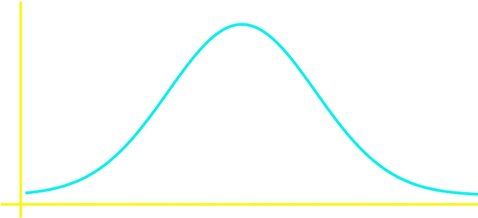
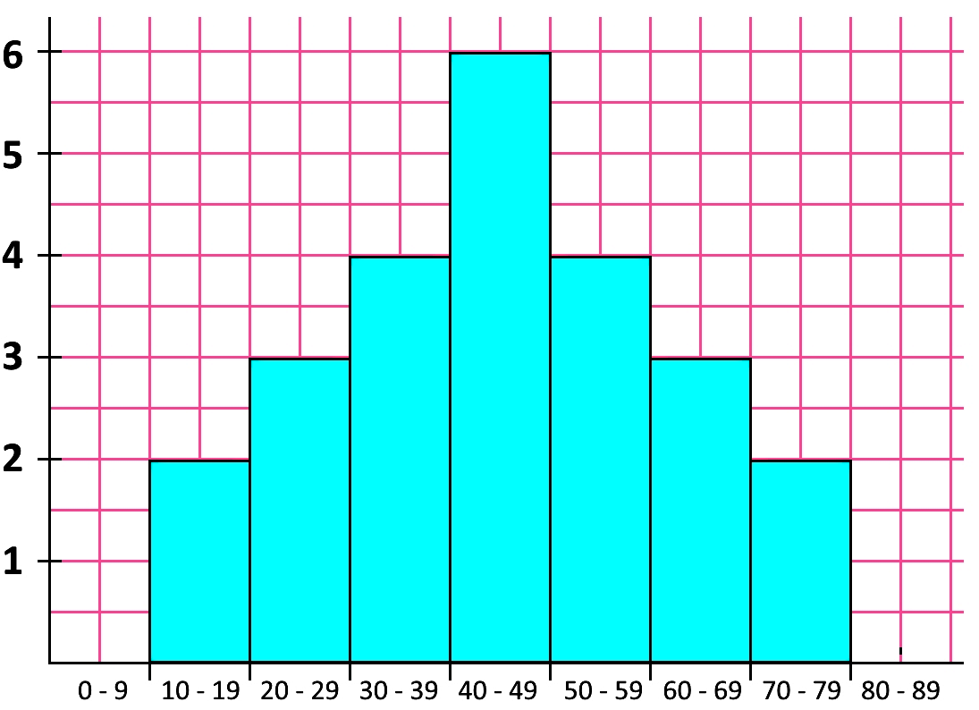
The distribution in figure 2 could be of any type, this figure just represents how a normal distribution would look like; for a more specific view of a distribution let us look at an example using a frequency distribution graph: a histogram.
• U Shaped
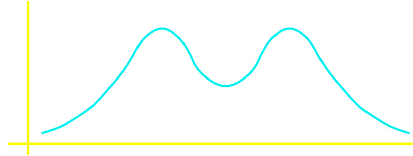
Now looking at a u shaped frequency distribution histogram:
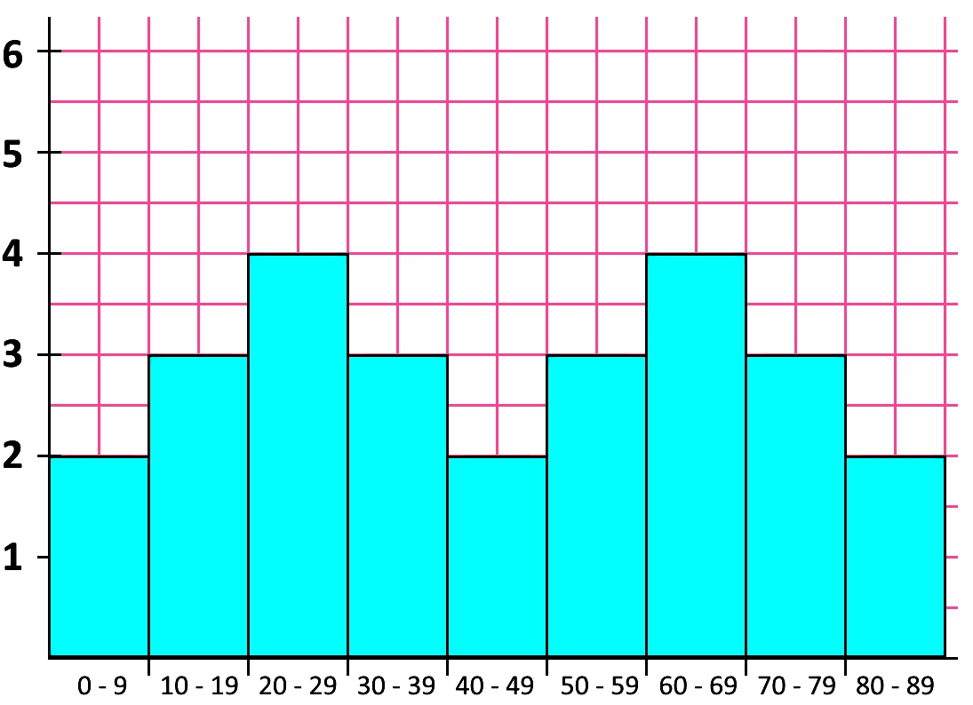
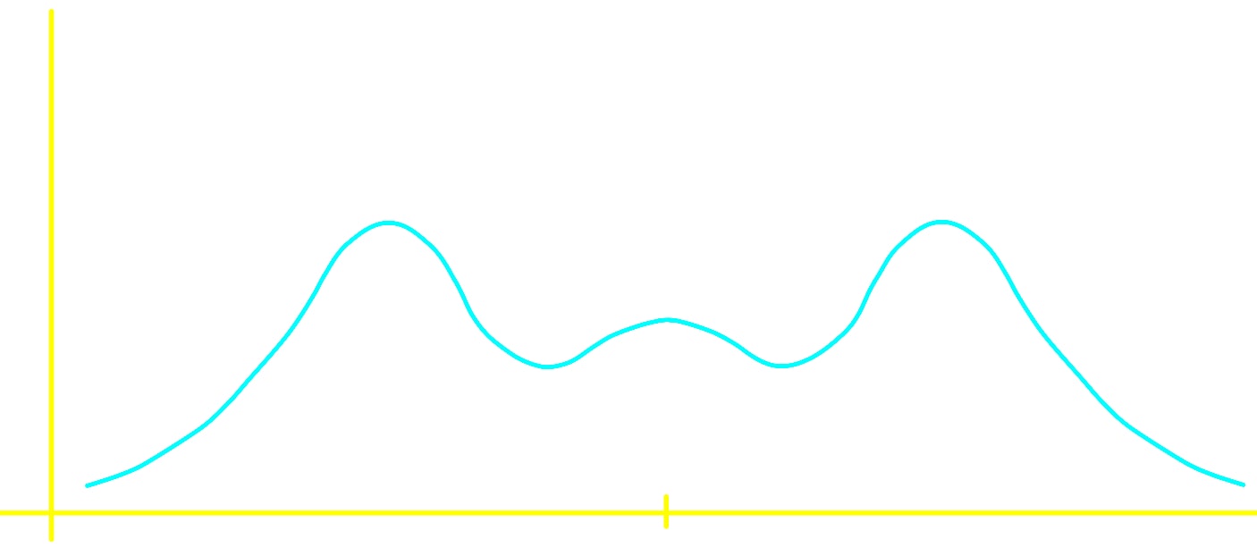
Although the bell shaped and the u shaped distributions (and their corresponding histogram distribution shapes) are the most common when looking at symmetric distributions, they are not the only ones that can occur. The next shape of a distribution is a good example of a symmetric distribution without a particular known shape, remember, as long as you can trace a vertical line at the center of the graph and use it as a symmetry axis where each side could be the mirrored image of the other, you have a symmetric shape of data distribution.

• Skewed
So what is the shape of this distribution? How does it look like? There are two options for this:
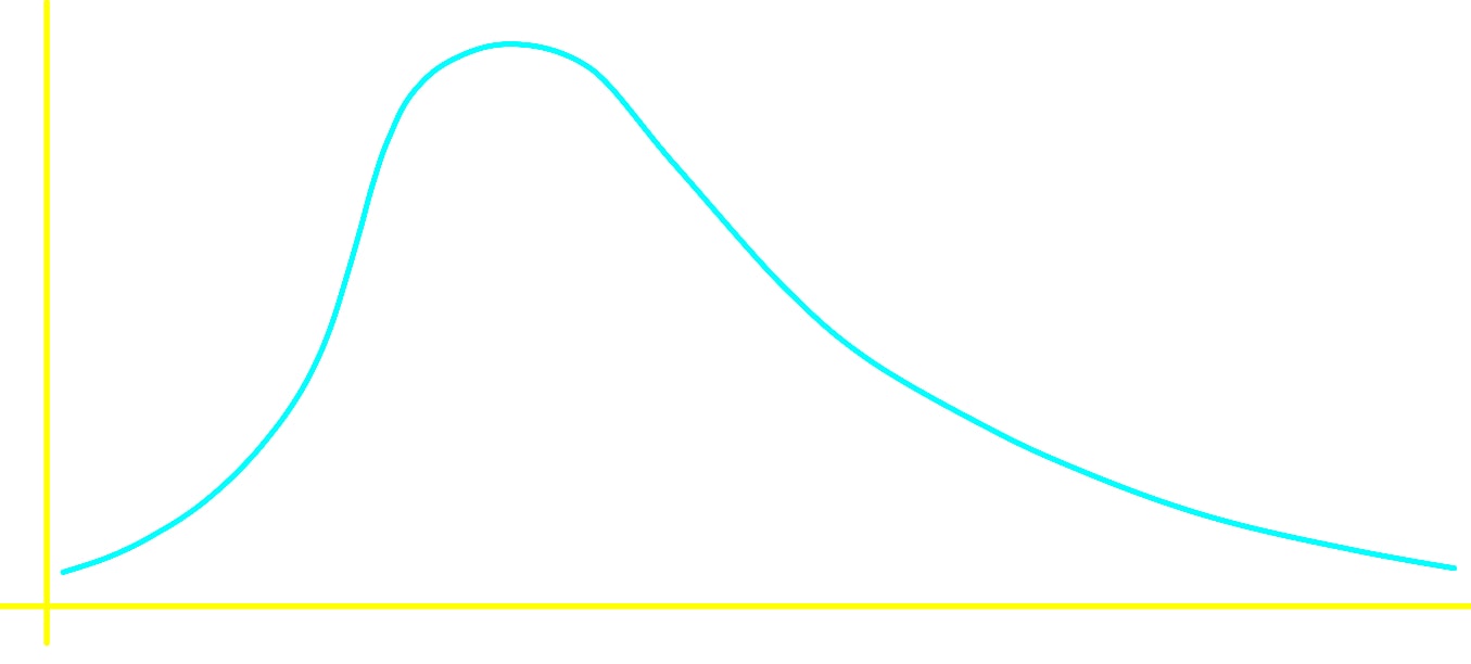
• Positively skewed
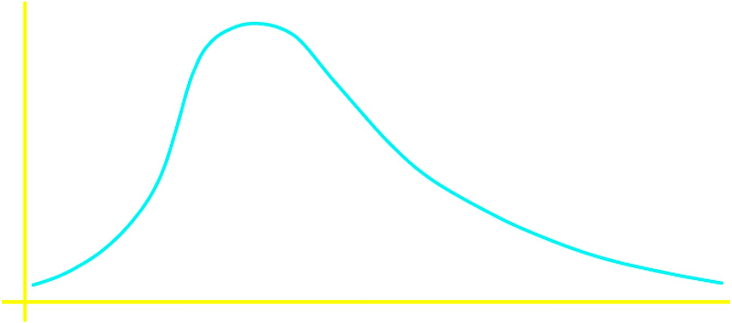
A positively skewed distribution is also said to be skewed to the right.
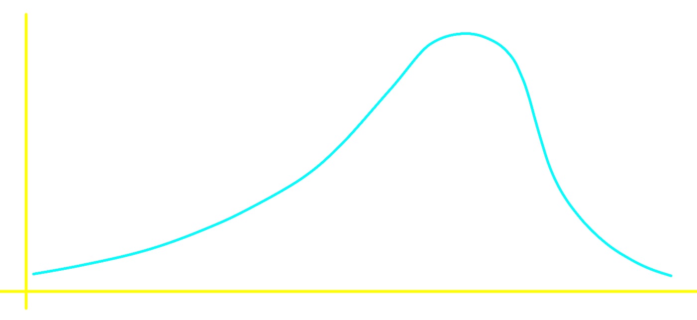
• Negatively skewed
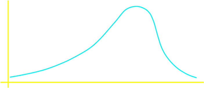
Notice that skewness to either one side or the other means that the tail is on the side to which the skewness is.
Now that you know about the bell-shaped distribution and the skewed distributions, take a look at the next figure where you can compare them:
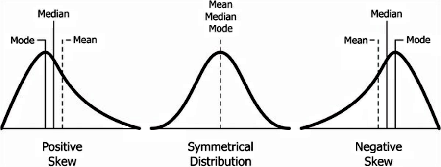
On our next lesson about the center of a data set we will learn about the mean, median and the mode.
• Uniform

How to describe the shape of a distribution
For this section, let us go back to figure 6 where the distribution is easily observed to be symmetric, still, it does not have a particular shape. When having a specific shape, such as the bell shape and the u shape, is very simple to describe the shape of the distribution; on the other hand, what happens when you cannot recognize any of these well known shapes? How to describe the shape of a distribution that has all kinds of curves, ups and downs? For that we need to tell if there are peaks, gaps or clusters in the distribution.
In a distribution graph, a gap is an interval which contains no data; on the other hand, a peak is the highest point of a data set. When several data points lie close together we say there is a cluster, which typically means that these data points have similar characteristics. We usually can define as homogeneous the points belonging to a cluster, because of the sharing of characteristics which makes them so similar to each other (Things which are very diverse or dissimilar are called heterogeneous)
And so, if we want to practice how to determine the shape of a distribution, let us take a look at the next examples:
Example 1
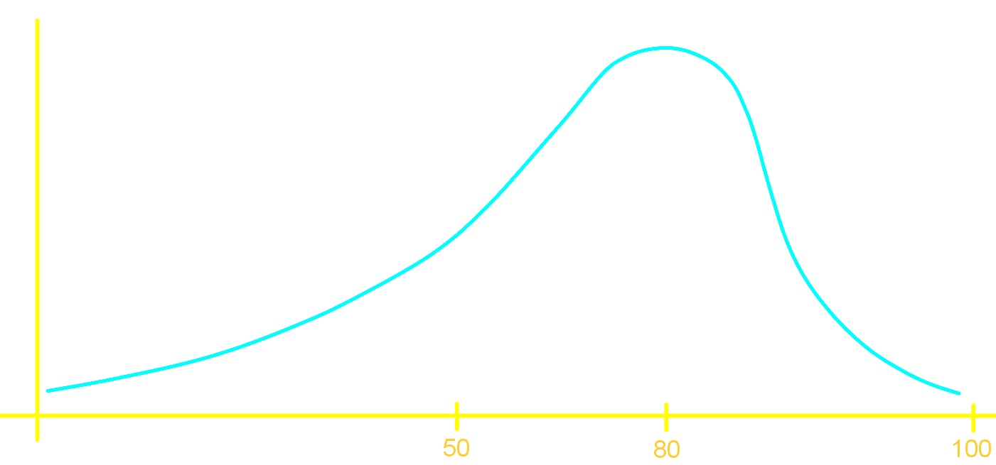
In Mrs. Katsufrakis class the scores for a test are given in the graph below: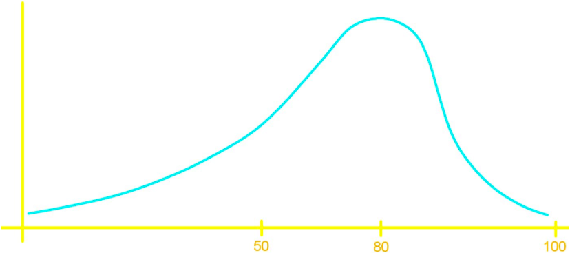
From the options below, what is the average score?
- 90%
- 80%
- 70%
The answer is number three: 70%, given that the graph is skewed to the left which produces the mean (average) to move towards the left too. In other words, the area on each side of the mean line must be the same, and given that the graph has a tail towards the left, is as if someone stretched it on that side and thus dragging what used to be the center (the mean is trying to get the central tendency) towards the left too.
If you have doubts about it go back and take a look at figure 9 for the negative skew distribution, where the mean line can be observed.
Example 2
A bank assures you that one of their tellers will be of assistance to you in 5 minutes or less. Further the bank tells you that the teller will become available equally likely at any time throughout those first 5 minutes. What does the distribution of this wait time look like?On this case we are working with a probability distribution, since we are talking about the probability of having a bank teller assist you in the next five minutes; therefore, the vertical axis of our distribution graph will represent the probability, and the horizontal axis will represent the time. Then, if the bank says that a teller will become available equally likely at any time throughout those 5 minutes, then we have equal chances of having a teller assist you in each minute of the whole range of the distribution; thus, the probability of being assisted at any minute out of the five, is . So, the probability distribution histogram looks like:
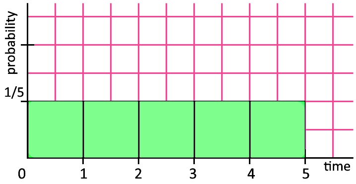
Since all of the possible outcomes have the same changes to occur, then the distribution is uniform.
Example 3
An IQ test has an average score of 100 and has more data clumped closer to the mean than further away. What is the shape of the distribution of an IQ test?This distribution must be a bell shaped distribution just because more data is clumped towards the mean than further away, this can be intuitively seen in our figures above describing the bell shape graphs, but further than that, this is a very important topic that will be covered in much more detail on our lesson for the normal distribution and continuous random variable.
Example 4
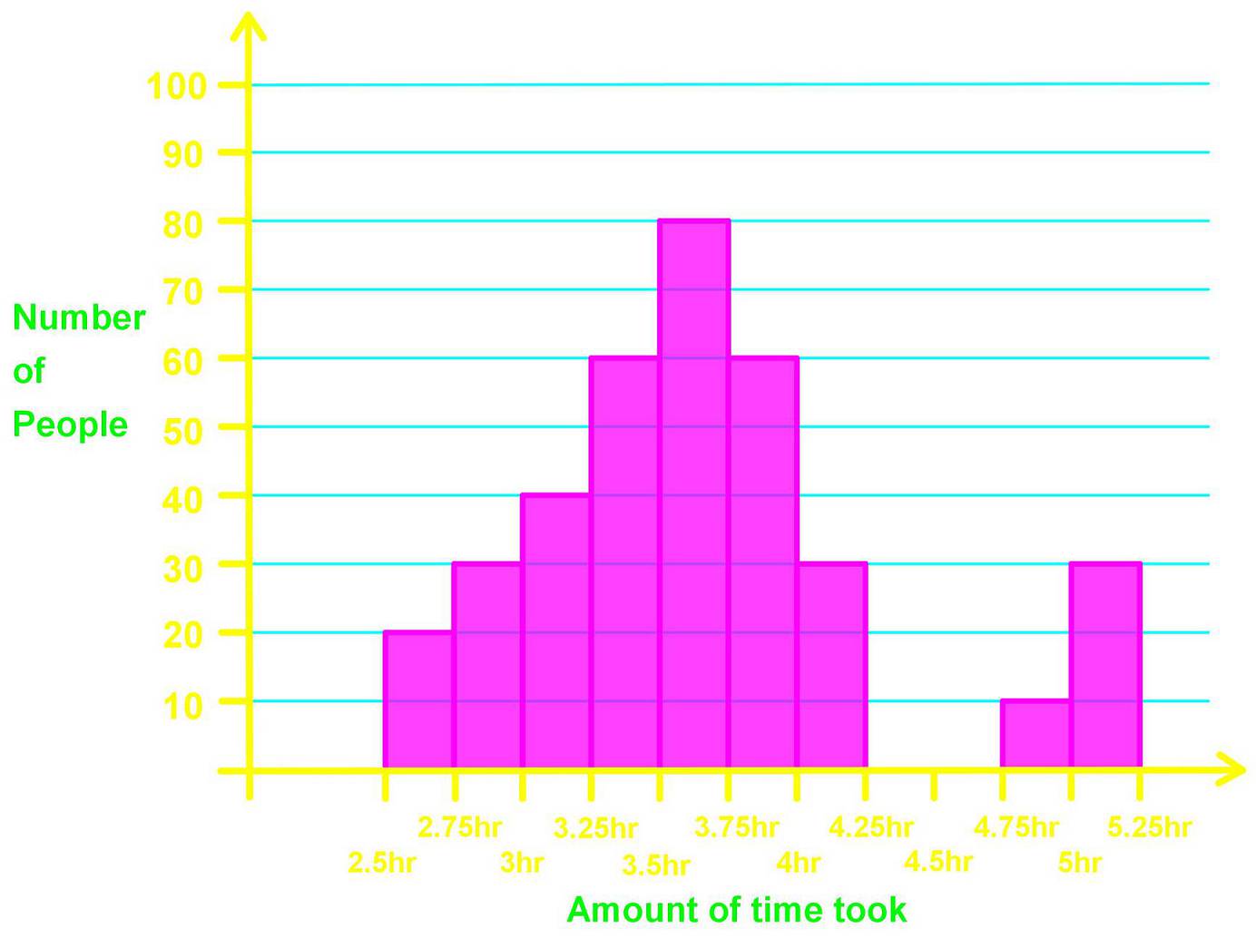
The finishing times of a marathon are given in the following distribution below: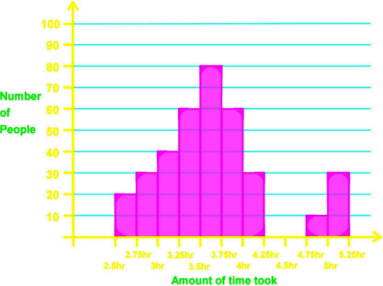
Signify where all the clusters, gaps and peaks are.
Looking at figure 13 we can instantaneously see there is a gap (remember,a gap in a distribution graph means an absence of data at a certain interval) from the 4.25 to the 4.75 hours; meaning no runners arrived within that time frame.
Then, the detection of the gap facilitates us the distinction of the two clusters in the distribution: the main cluster is the one on the left side which goes from the interval of 2.5 to the 4.25 hours, and then the second cluster goes from 4.75 hours to 5.25 hours. And finally let us look at the peaks: there is only one highest peak among the data columns in the distribution histogram, and this one belongs to the class interval of 3.5 to 3.75 hours.
To finalize our lesson we recommend you to take a look at this article where typical histogram shapes are presented, and many of them are different from the distribution shapes we have talked about today. Also, this article on the shapes of distributions has useful information that may complement what we saw here today.
So, this is it for our lesson of today, see you in the next one!
There are two main types of Distribution we are concerned with in statistics:
Frequency Distributions:
A graph representing the frequency of each outcome occurring.
Probability Distributions:
A graph that provides the probability of each outcome occurring.
The most common distribution shapes are:
Symmetric:
Bell-shaped:
Skewed to the left:
Skewed to the right:
Uniform:

Cluster:
On a graph a cluster is when several data points lie close together. Typically this means that these data points have similar characteristics, which is also called things are homogeneous (Things which are very diverse or dissimilar are called heterogeneous)
Gap:
A gap is an interval which contains no data.
Peak:
A peak is the highest point of a data set.
Frequency Distributions:
A graph representing the frequency of each outcome occurring.
Probability Distributions:
A graph that provides the probability of each outcome occurring.
The most common distribution shapes are:
Symmetric:

Bell-shaped:

Skewed to the left:

Skewed to the right:

Uniform:

Cluster:
On a graph a cluster is when several data points lie close together. Typically this means that these data points have similar characteristics, which is also called things are homogeneous (Things which are very diverse or dissimilar are called heterogeneous)
Gap:
A gap is an interval which contains no data.
Peak:
A peak is the highest point of a data set.

