Frequency polygons
We learnt in our past lesson that it is important to have methods that will allow you to present data gathered during a statistical analysis in a way that is easy to understand and interpret. Such methods are not only useful for presenting the data and communicate it easily towards others who may or may not have an idea about the topic that is being studied, but also to understand the mathematical relationships among the studied variables and some further knowledge we could obtain.
Then, we continue the talk about graphic representations of frequency distributions on this lesson, but now we focus on a new type of graph: a frequency polygon.
What is a frequency polygon in statistics
We know from basic algebra that a polygon is a two-dimensional geometrical figure that is formed by a consecutive series of straight lines coming together at their ends; the union of these straight lines forms corners named the vertices of the polygon, and each of the lines represents a side of it.
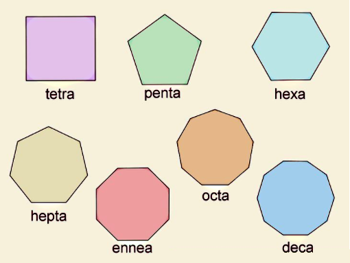
The word polygon comes from the greek expression that means to have many angles, and so, each polygon receives a distinct name depending on the amount of interior angles formed by their vertices (the amount of angles happen to be the same amount as their sides).
There are two basic types of polygons, regulars and irregulars. Regular polygons have all of their sides of the same length and their interior angles are all the same size; on the other hand, irregular polygons happen to be any plane figure formed by the connection of straight lines into a closed loop, no matter the size of each of the sides or the angles they form.
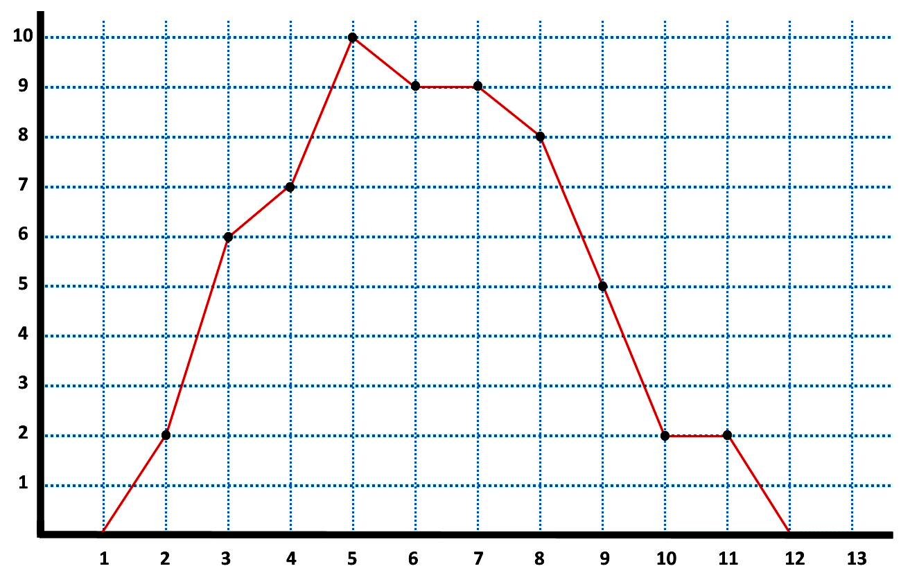
And so, what is a frequency polygon? A frequency polygon is a line graph that produces a plane figure (two-dimensional figure) which results from the shape of a frequency distribution midpoints being graphed; in simple words, a frequency polygon allows us to see the rough resulting shape of a histogram, and as you can imagine, this will be more than likely an irregular polygon. An example of a frequency polygon graph is shown below:
Characteristics of frequency polygon
A frequency polygon is a particular line graph related to a frequency distribution, for that reason, it shares most of its characteristics with any regular line graph which, at this point, you probably know very well. However, even if simple, we use frequency polygons in statistics because when compared to a histogram, they can be plotted in the same grid for comparison.
For example: since you can actually plot many frequency polygons in the same graph, this allows the statistician to directly see the differences between them, tendencies of each data set being represented on each polygon can be observed, and if any, one can find proportional relationships between one data set and the other more efficiently. Nice huh? Now, how do we make one?
Taking the example problem 1 from our past lesson on frequency distribution and histograms, let us construct a frequency polygon from the data and distribution presented.
First, let us take a look at the data provided:
Listed below are the heights of a class of 7th graders.

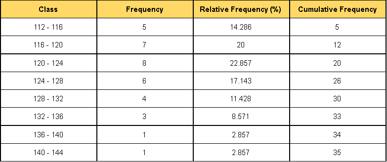
For which a table containing the frequency distribution, the relative frequency distribution and the cumulative frequency distribution, was constructed:
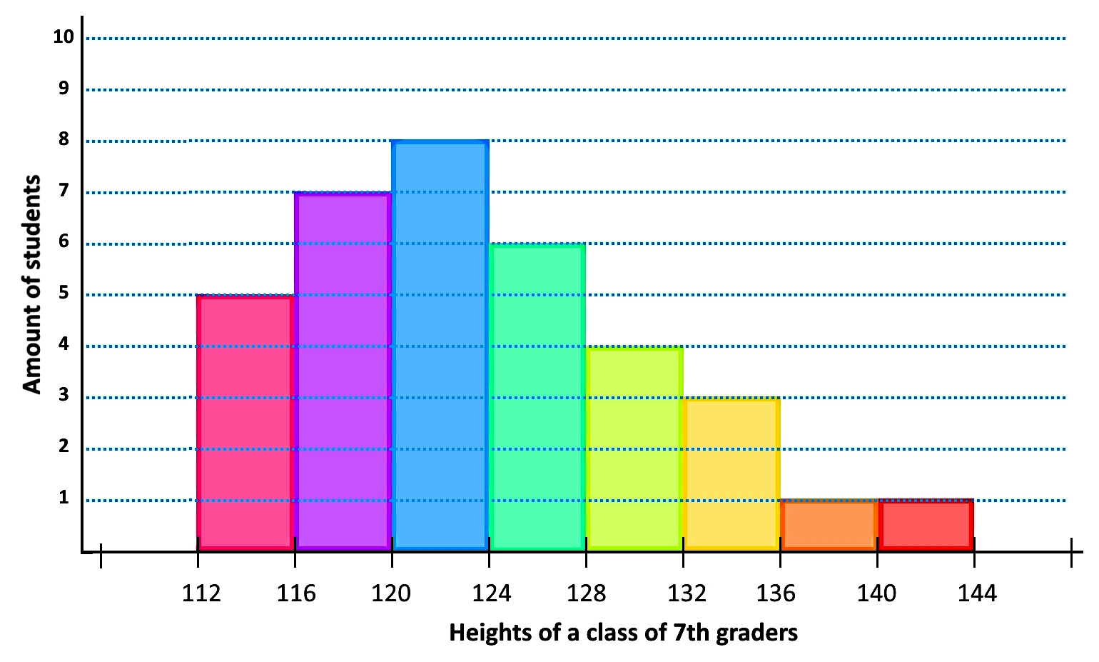
And then, the following histogram was the final result for representing the frequency distribution in a graphic manner.
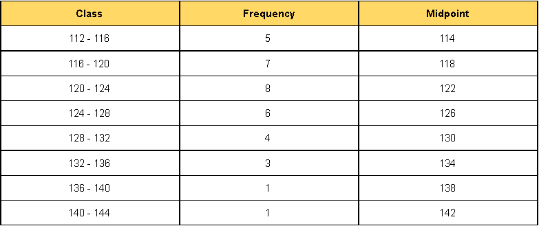
Now, the question is: how to make a frequency polygon with the information we have so far? We start by finding the midpoints of every single class in the histogram. Remember the formula for the midpoints goes as follows:
And so, the resulting midpoints for each class are:
Plotting the midpoints at the top of each of the corresponding columns in the histogram:
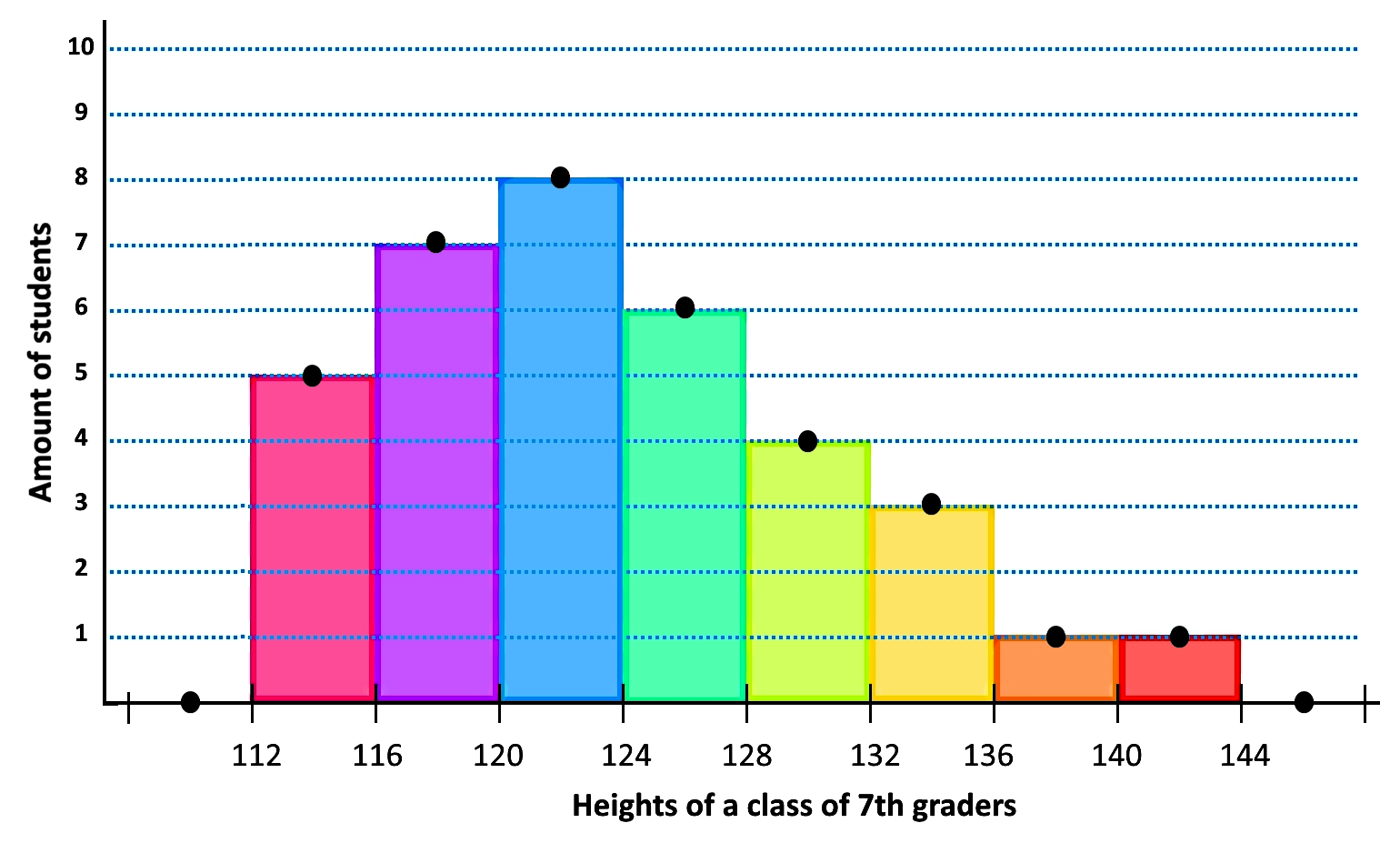
Notice that although there is no data for the range in the horizontal axis from 0 to 112 we have plotted a midpoint from the range 108 to 112 with a value of zero. We have done the same for the range right after our highest class, and so, we plotted a midpoint with the value of zero for the range 144 to 148. There is a reason why we have done so, we will explain it in figure 10.
Now you have to connect all of the midpoints with a straight line to form:
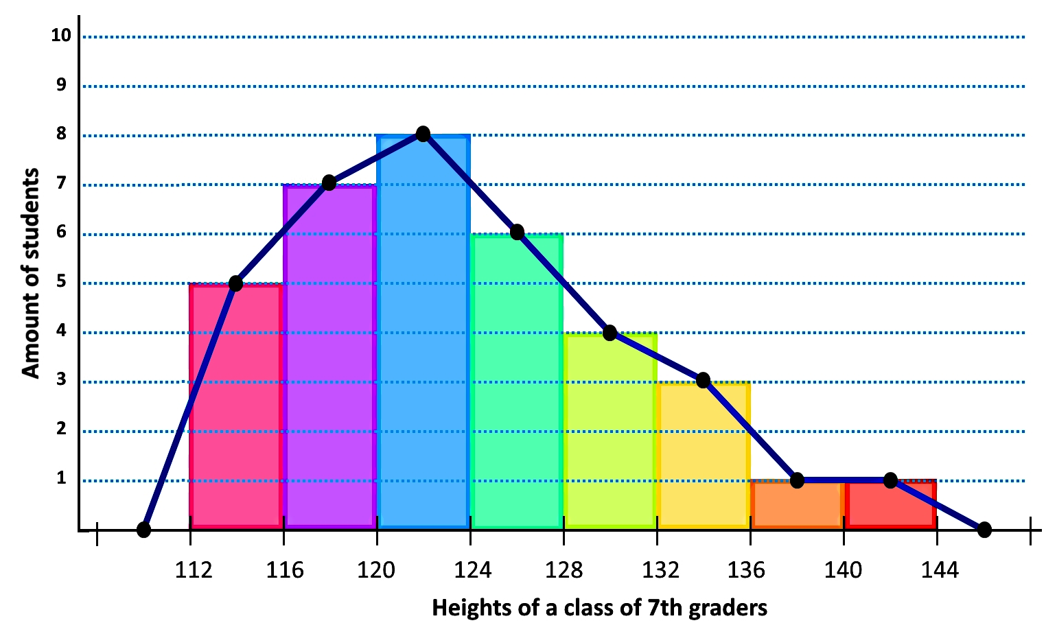
And so, your frequency polygon graph is done! Now let us take the histogram away:
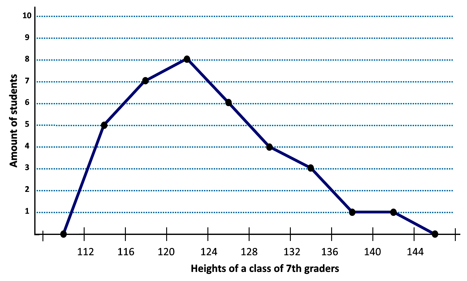
Now you can clearly see the characteristics of a frequency polygon line graph: dots and lines connected forming an irregular two dimensional figure (hence the name polygon) producing the rough shape of the frequency distribution.
But let us go back for a moment and explain: why is it that you need to use a midpoint with a value of zero for the range right before the first class interval and right after the last class interval? The reason is that the frequency polygon must have the same surface area as the histogram because they are representing the same frequency distribution, and using these two zero-valued points allows us to complete the shape of the polygon while meeting this condition:

In summary, once you have a frequency distribution table and have calculated the midpoints from all the interval classes of the distribution, the steps to construct the corresponding frequency polygon are:
- Create a histogram.
- Plot the midpoints for each bar on the histogram.
- Plot a midpoint with a value of zero on the range before the smallest class.
- Plot a point with a value of zero on the range after the largest class.
- Connect all the data point with a straight line.
Remember that you could also use the values of the relative frequency and the cumulative frequency midpoints to construct a line graph (just as how we did it with the frequency values); in this case, the graphs would be called a relative frequency polygon and a cumulative frequency polygon respectively.
Frequency polygon uses
Now that we have learnt the frequency polygon definition, and how to construct one it is time you put your hands at work and practice how to do a frequency polygon yourself, and for that, let us take a look at some examples. We recommend you to work on the example problems on your own and then come back and check the answers.
Example 1
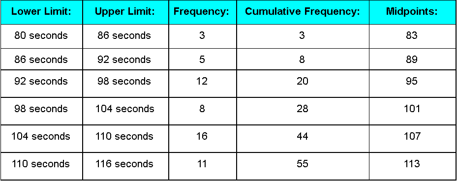
Constructing a Frequency Polygon from a Frequency DistributionThe following frequency table shows the amount of time it took 55 ski racers to complete a ski course:
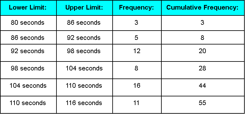
- Using the frequency distribution table construct a frequency polygon
- Using the frequency distribution table construct a cumulative frequency polygon
Let us work on the first part of this example problem by adding a column to the table in figure 11 where we will put the midpoint values to be used to make the graph. Thus, we rewrite the table as:
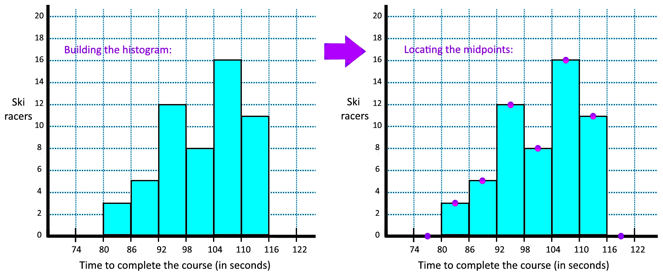
Following the steps described in our last section, we make the histogram of the frequency distribution and then locate the midpoints at the top of each column in the histogram. Also, include the midpoints for ranges before and after the class intervals provided:
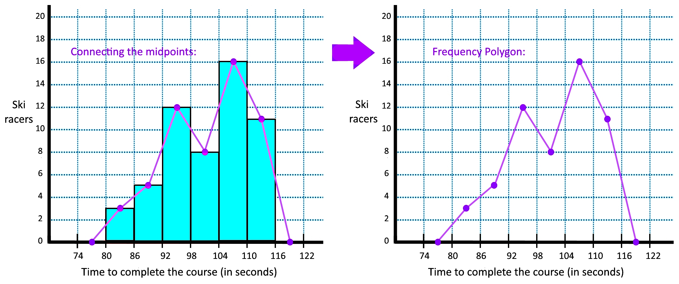
Then we just connect all of the midpoints with straight lines, and we have our frequency polygon:
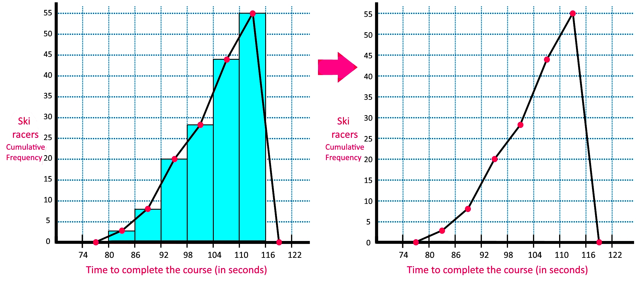
For the second part of this example exercise, we build the frequency polygon of the cumulative frequency distribution (basically, constructing the polygon based on the data from the 4th column in figures 11 and 12). We just follow the exact steps that we have done before:
Construct the histogram for the distribution (in this case the cumulative), locate the midpoints on top of each column, set zero-valued midpoints for ranges before the first class and after the last class, and finally, connect the midpoint dots with straight lines. The result can be seen below:
As you can see, constructing frequency polygons is very simple, so this is a very good example on how simple tools can be quite useful to administrate and resolve large data sets. Let us continue with one more example where instead of producing the frequency polygon yourself, you will be provided with one, and in charge of analyse it to answer some questions.
Example 2
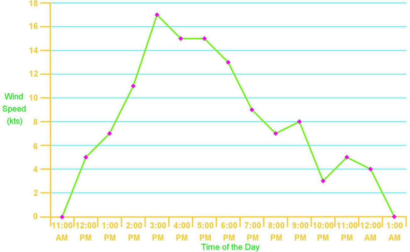
Interpreting a Frequency Polygon.The frequency polygon below shows the wind speed (in knots) during a particular day in San Francisco Bay:
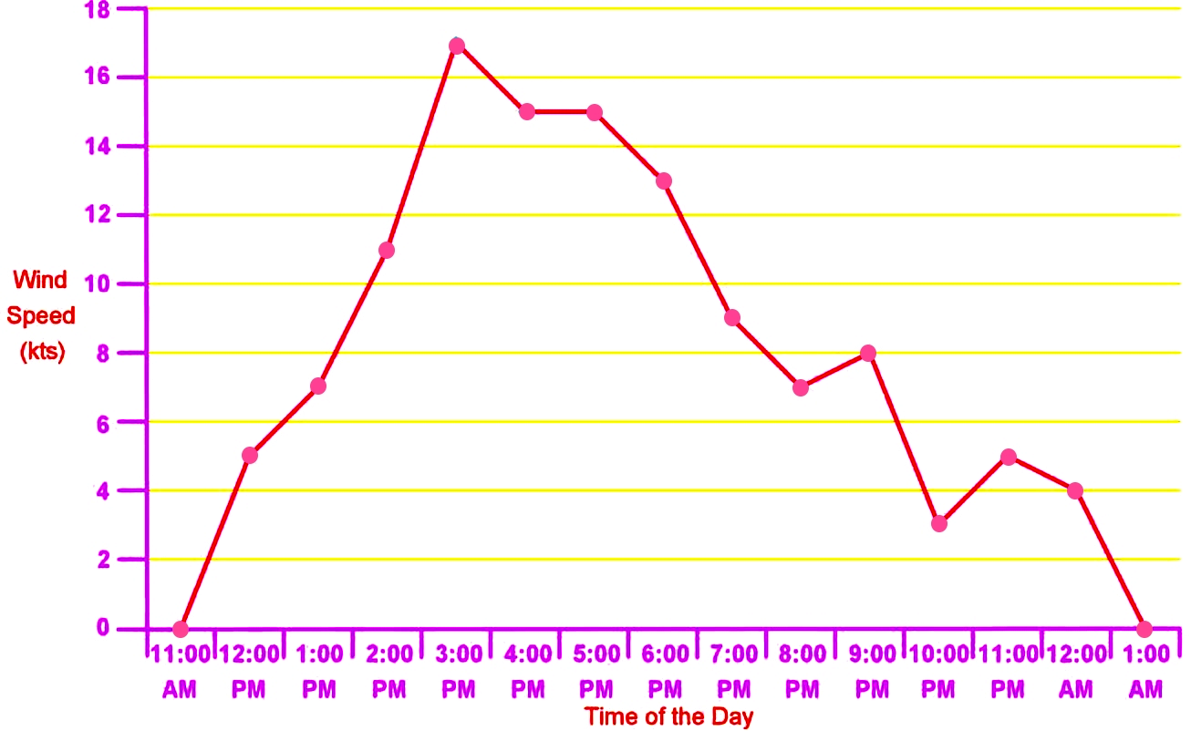
Answer the following frequency polygon questions:
- What was the highest wind speed recording during this day? What was the lowest wind speed recorded?
The highest wind speed of the day was recorded at 3PM with a value of 17 knots. The lowest wind speed was recorded at 10PM with a value of 3 knots.
- During how many hours in this day was the wind speed recorded?
During 13 hours. Remember the first and last midpoints in the graph with a value of zero have been added to the frequency distribution polygon in order to meet the condition for same surface area as the corresponding histogram; they do not represent an hour of measurement of this data.
- How many hours of the day had more than 10 knots of wind speed?
5 hours.
- How many hours of the day had between 2-6 knots of wind speed?
4 hours
So this is it on our lesson for frequency polygons, to end the topic for today we have a few recommendations for you: The next site put some detail to explain frequency polygon and even includes a few practice questions.
Then, the next link on descriptive statistics not only defines what is a frequency polygon in statistics, but it goes through many other important concepts related to it and ways to present data in a graphic manner.
This is the end of our lesson, see you in the next one!
1) Create a histogram
2) Plot the midpoints for each bar on the histogram
3) Plot a point with a value of zero one bar below the smallest class. Also plot a point with a value of zero one bar above the largest class
4) Connect all the data point with a straight line

