Critiquing data presentation

Get the most by viewing this topic in your current grade. Pick your course now.

Now Playing:Critiquing data presentation – Example 1a
Examples
  1. Below are the results of a marketing survey done by a travelling company on activities people prefer to do in holidays.

    Activity

    Number of people

    Stay home

    35

    Travel

    45

    Read

    30

    Spend time with friends

    50

    Total

    155
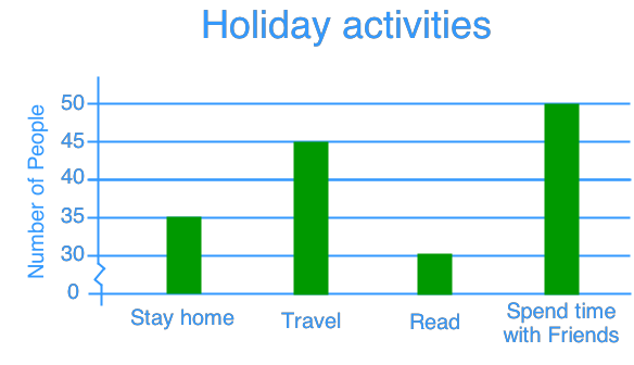

    Critiquing data presentation
    1. If the travelling company claims that travelling is about 2 times more popular than staying home, is the company correct? Explain.

    2. Describe how the graph can be more accurate.

Reading and drawing bar graphs
Jump to:NotesRelated
Notes
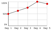
It is important to present data accurately. One way to make data easy to understand is to draw them in graphs, such as line graphs, histograms, bar graphs and pictograms. However, if they are not drawn properly, these graphs can be very misleading too. In this section, we will learn how to critique graphs and the ways to improve them.