Mastering Pictographs: From Basic Concepts to Advanced Techniques
Dive into the world of pictographs and learn how to effectively represent data visually. Discover techniques for creating, interpreting, and analyzing pictographs to enhance your data literacy skills.

  1. Intros0/4 watched
  2. Examples0/16 watched
  3. Practice0% mastered
  1. 0/4
  2. 0/16
  3. 0%
Now Playing:Pictographs – Example 0a
Intros
0/4 watched
  1. Introduction to Pictographs:
  2. Introduction to Pictographs:
    What is a pictograph?
  3. Introduction to Pictographs:
    How to read a pictograph
Examples
0/16 watched
  1. Understanding symbols and scale
    Fill in the blanks about the symbols and scale
    1. If Pictographs 
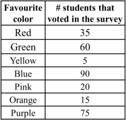
represents 6 oranges, then Pictographs represents ___ oranges.

    2. If Pictographs represents 60 pizza slices, then Pictographs represents ___ pizza slices.

    3. If Pictographs represents ___ pencils, then represents 5 pencils.

    4. If Pictographs 
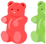
represents 6 gummy bears, then Pictographs represents ___ gummy bears.

    5. If Pictographs represents ___ donuts, then Pictographs represents 6 donuts.

Practice
0%
Build your skill!Try your hand with these practice questions.
Pictographs
Notes

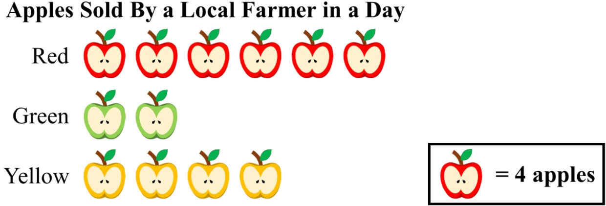
In this lesson, we will learn:

  • How to read a pictograph
  • How to understand the symbols and scales for pictographs
  • How to choose a scale when creating a pictograph

Notes:

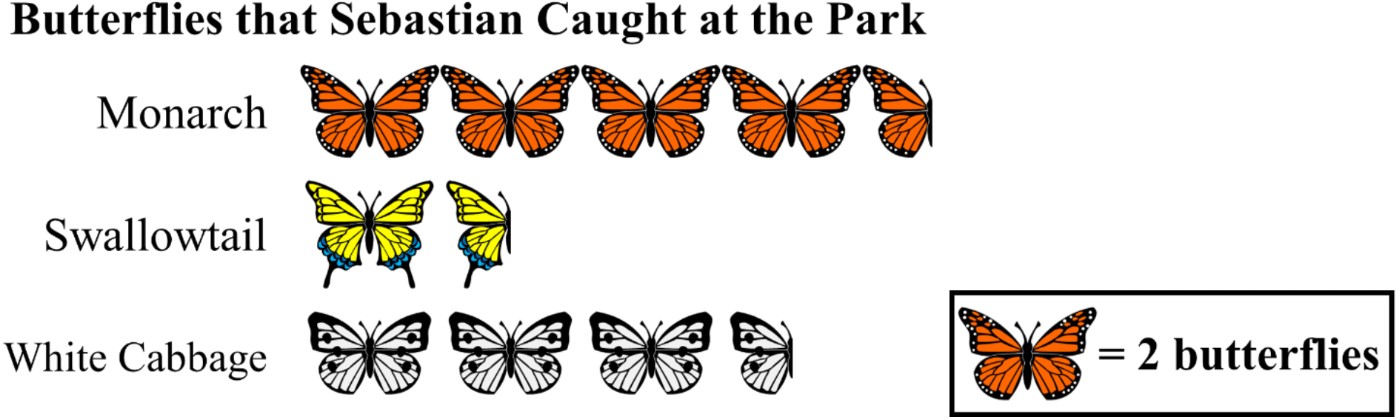
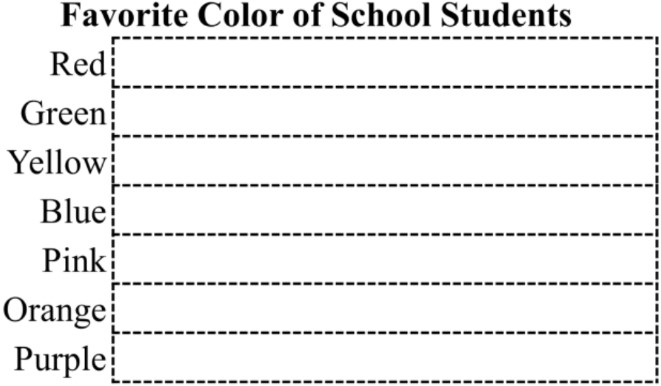
  • A pictograph is a graph that displays frequency data using picture symbols
    • It is a great visual tool to show numbers in different categories from data collection experiments (i.e. surveys)

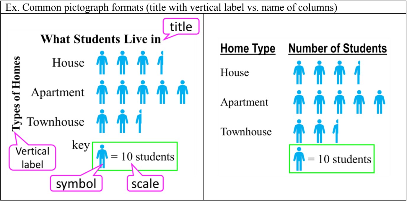
  • The parts of a pictograph can include:
    • a title to describe the data collected
    • categories listed vertically (and sometimes, the category column names)
    • (sometimes) a vertical label to describe the types of categories
    • a key to show the symbol and scale (how much each symbol is worth)

Pictographs

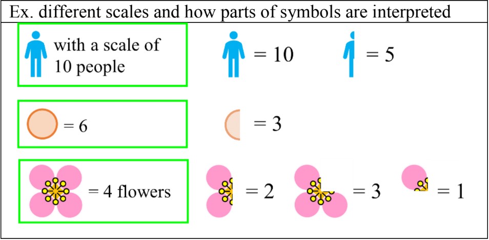
  • Symbol scales can use whole symbols, half symbols, or even fractional symbols:

Pictographs

  • To choose a scale for a data set, find a common factor for all the numbers (a number that can be multiplied into all the numbers of the data set). It is that more than one scale will work.
    • Ex. a data set with a scale of 4 could also use a scale of 8 (doubled); the pictograph will look neater and use less symbols to represent numbers
Concept

Introduction to Pictographs

Pictographs are a visually engaging form of data representation that use simple pictures or symbols to convey information. These eye-catching charts play a crucial role in making complex data more accessible and understandable to a wide audience. In our introduction video, we'll explore the basics of pictographs and their significance in various fields, from education to business. This lesson will guide you through the essential skills of reading, interpreting, and creating pictographs effectively. You'll learn how to decipher the meaning behind different symbols, understand the scale and proportions used, and gain insights from the data presented. Additionally, we'll cover the step-by-step process of designing your own pictographs, enabling you to present information in a clear and visually appealing manner. By mastering pictographs, you'll enhance your ability to communicate data-driven stories and make informed decisions based on visual representations.

FAQs
  1. What is a pictograph and how is it different from other types of graphs?

    A pictograph is a visual representation of data that uses symbols or icons to represent quantities. Unlike bar graphs or line charts, pictographs use relatable images to make data more engaging and easier to understand at a glance. Each symbol in a pictograph represents a specific quantity, making it particularly effective for displaying frequency data or survey results.

  2. How do I interpret half symbols in a pictograph?

    Half symbols in a pictograph represent half the value of a whole symbol. For example, if one whole symbol represents 10 units, a half symbol would represent 5 units. To calculate the total value, add the value of whole symbols and then add the value of any half symbols. This allows for more precise representation of data that doesn't align perfectly with the chosen scale.

  3. What factors should I consider when choosing a scale for my pictograph?

    When choosing a scale for your pictograph, consider the range of your data and look for common factors among the values. A good scale should allow for a neat presentation without overcrowding or oversimplifying the information. Larger scale factors often result in cleaner, more compact pictographs. Also, consider using a scale that allows for whole or half symbols rather than complex fractions for easier interpretation.

  4. How can I make my pictographs more visually appealing and effective?

    To create visually appealing and effective pictographs, use simple, recognizable symbols that relate directly to your data. Maintain consistency in symbol size and style, and use a complementary color scheme. Include a clear legend or key to explain what each symbol represents. Avoid clutter by using an organized layout and consider grouping symbols logically (e.g., in rows of ten) for easier counting. Ensure that your pictograph is accessible by choosing colors that are distinguishable for color-blind individuals.

  5. What are some common mistakes to avoid when creating pictographs?

    Common mistakes to avoid when creating pictographs include using too many different symbols in one graph, which can overwhelm viewers. Don't distort the scale to exaggerate differences, as this can mislead your audience. Ensure that the total number of symbols accurately represents the data sum. Be cautious with 3D effects, as they can sometimes distort the perception of quantity. Lastly, avoid using overly detailed or abstract symbols that might distract from or confuse the data being presented.

Prerequisites

Before delving into the world of pictographs, it's crucial to understand the foundation upon which this visual representation of data is built. One of the most important prerequisite topics for mastering pictographs is influencing factors in data collection. This fundamental concept plays a significant role in shaping the accuracy and reliability of the information presented in pictographs.

Pictographs, also known as pictograms or icon charts, are a powerful tool for displaying quantitative information using pictures or symbols. They provide a visually appealing and easily understandable representation of data, making them popular in various fields, from education to business. However, the effectiveness of a pictograph heavily relies on the quality and integrity of the data it represents.

Understanding the influencing factors in data collection is essential because it directly impacts the creation and interpretation of pictographs. These factors can include sample size, data collection methods, potential biases, and environmental conditions. By grasping these concepts, students can better appreciate the importance of accurate data gathering and its influence on the final pictograph presentation.

For instance, if the data collection process is flawed or biased, the resulting pictograph may misrepresent the true nature of the information. This could lead to incorrect conclusions or misguided decision-making based on the visual representation. Therefore, a solid understanding of data collection principles ensures that students can critically evaluate the pictographs they encounter and create more reliable ones themselves.

Moreover, knowledge of data collection experiments helps students recognize the limitations and potential errors in pictographs. They can identify when a pictograph might be oversimplifying complex data or when it may be necessary to dig deeper into the underlying information. This critical thinking skill is invaluable in today's data-driven world, where visual representations of information are increasingly common.

By mastering the prerequisite topic of influencing factors in data collection, students lay a strong foundation for working with pictographs. They develop the ability to gather high-quality data, design effective pictographs, and interpret them accurately. This knowledge enhances their overall statistical literacy and prepares them for more advanced concepts in data visualization and analysis.

In conclusion, the journey to understanding pictographs begins with a solid grasp of data collection principles. By investing time in learning about influencing factors in data collection, students equip themselves with the necessary skills to create, interpret, and critically evaluate pictographs. This foundational knowledge not only enhances their ability to work with this specific type of data visualization but also contributes to their overall proficiency in statistics and data analysis.