Mastering Carroll Diagrams: The Ultimate Guide to Data Organization
Discover how Carroll diagrams revolutionize data organization. Learn to create, interpret, and apply these powerful tools for clearer analysis and decision-making in various fields.

  1. Intros0/4 watched
  2. Examples0/8 watched
  3. Practice0% mastered
  1. 0/4
  2. 0/8
  3. 0%
Now Playing:Carroll diagrams – Example 0a
Intros
0/4 watched
  1. Introduction to Carroll Diagrams:
  2. Introduction to Carroll Diagrams:
    How are Carroll Diagrams different from Venn Diagrams?
  3. Introduction to Carroll Diagrams:
    Matching the attribute regions of a Carroll Diagram with a Venn Diagram
Examples
0/8 watched
  1. Organizing objects into a Carroll diagram
    Sort the set into the Carroll diagram
    1. Carroll Diagrams

    2. Carroll Diagrams

Practice
0%
Build your skill!Try your hand with these practice questions.
Carroll diagrams
Notes

In this lesson, we will learn:

  • What the regions of the Carroll Diagram mean in order to sort objects by their attributes
  • The similarities and differences between the Carroll Diagram and Venn Diagram
  • How to describe pairs of opposite attributes

Notes:

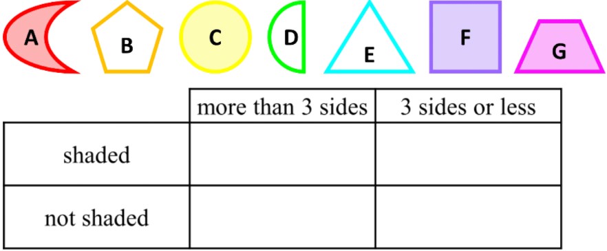
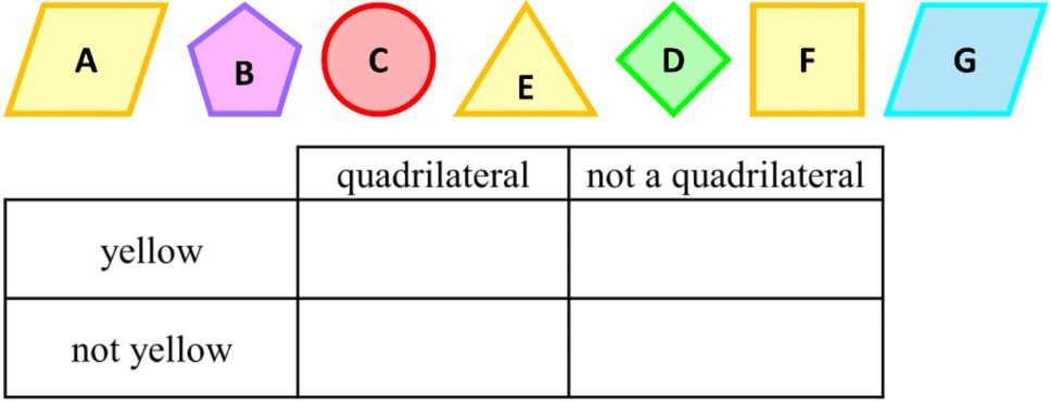
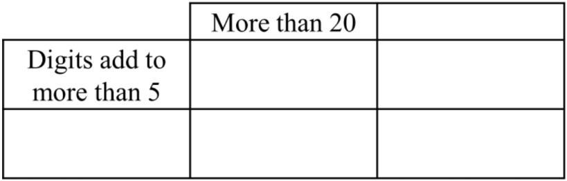
  • Carroll Diagrams organize data in a table combining yes-or-no attributes
    • i.e. attribute #1 (yes) and NOT attribute #1 (no)
Carroll Diagrams

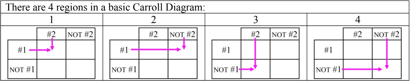
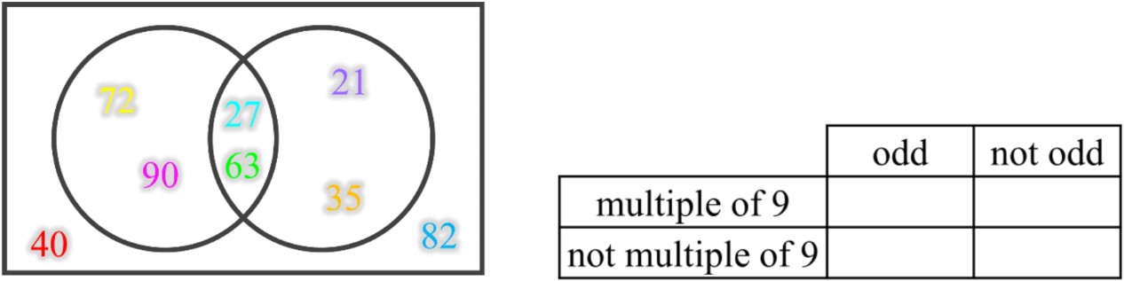
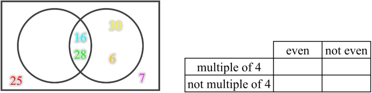
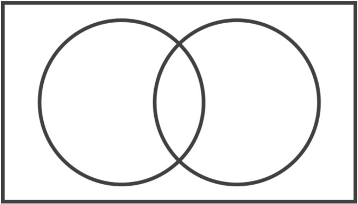
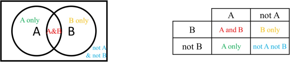
  • Sorting Data with Carroll Diagrams is similar to Venn Diagrams
    • Venn diagrams use circles to group what belongs or does not belong
    • Carroll diagrams use the column (vertical) and row (horizontal) of boxes
Carroll Diagrams

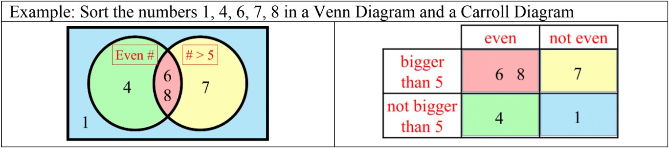
  • The regions in a Carroll Diagram and Venn Diagram are the same:
Carroll Diagrams

  • Some examples for pairs of opposite yes-or-no attributes:
    • "even number" and "not even number" (odd)
    • "odd number" and "not odd number" (even"
    • "less than 10" and "not less than 10" (10 or more)
    • "more than 5" and "not more than 5" (5 or less)
Concept

Introduction to Carroll Diagrams

Carroll diagrams are powerful tools for organizing and visualizing data in a structured manner. Named after Lewis Carroll, these diagrams provide a clear and efficient way to classify information based on specific attributes. Our introduction video offers a comprehensive overview of Carroll diagrams and their applications. The primary purpose of these diagrams is to sort data into distinct categories, making it easier to analyze and draw conclusions. As you explore Carroll diagrams, you'll focus on three main learning objectives. First, you'll gain a deep understanding of the different regions within the diagram and how they represent various data categories. Second, you'll compare Carroll diagrams with Venn diagrams, noting their similarities and differences in data representation. Lastly, you'll learn to describe opposite attributes, a key feature of Carroll diagrams that allows for comprehensive data classification. By mastering these concepts, you'll enhance your ability to organize and interpret complex information effectively.

FAQs
  1. What is a Carroll diagram?

    A Carroll diagram is a visual tool used to organize and classify data based on specific attributes. It's named after Lewis Carroll and consists of a grid-like structure where data points are sorted into categories based on whether they possess certain characteristics or not.

  2. How does a Carroll diagram differ from a Venn diagram?

    While both diagrams are used for data organization, Carroll diagrams use a grid structure with clearly defined boundaries for each category, based on yes/no attributes. Venn diagrams, on the other hand, use overlapping circles to show relationships between sets. Carroll diagrams are better suited for binary classifications across multiple attributes.

  3. What are opposite attributes in Carroll diagrams?

    Opposite attributes in Carroll diagrams are pairs of mutually exclusive characteristics used to categorize data. For example, "even" and "odd" for numbers, or "has wings" and "doesn't have wings" for animals. These attribute pairs create distinct categories that cover all possible options for the data being classified.

  4. How do you create a Carroll diagram?

    To create a Carroll diagram: 1) Choose two pairs of opposite attributes, 2) Draw a rectangle and divide it into four sections, 3) Label the top and left side with your attributes, 4) Add "Yes" and "No" labels for each attribute, 5) Sort your data points into the appropriate sections based on their characteristics.

  5. What are some practical applications of Carroll diagrams?

    Carroll diagrams have various applications, including: education (teaching set theory and classification), business (customer segmentation), quality control (defect classification), data science (exploratory data analysis), and project management (task prioritization). They are particularly useful in scenarios requiring classification based on multiple binary criteria.

Prerequisites

Before delving into the world of Carroll diagrams, it's crucial to have a solid foundation in certain prerequisite topics. One of the most important concepts to grasp is the classification of data. Understanding this fundamental principle is essential for effectively utilizing Carroll diagrams and maximizing their potential in data organization and analysis.

Carroll diagrams are powerful tools used to sort and categorize information based on specific attributes or characteristics. To fully appreciate their functionality and application, a strong grasp of data classification techniques is paramount. The ability to identify, organize, and group data according to shared properties forms the backbone of working with Carroll diagrams.

When exploring data classification techniques, students learn how to distinguish between different types of data and recognize patterns within datasets. This knowledge directly translates to the creation and interpretation of Carroll diagrams. By understanding how to classify data effectively, students can more easily construct meaningful categories and subcategories within a Carroll diagram, leading to clearer visual representations of complex information.

Moreover, the principles of data classification help in determining which attributes are most relevant for sorting information in a Carroll diagram. This skill is crucial for creating diagrams that are not only accurate but also insightful and useful for decision-making processes. Without a solid understanding of data classification, students might struggle to identify the most appropriate criteria for organizing information within a Carroll diagram, potentially leading to confusion or misinterpretation of the data.

The connection between classification of data and Carroll diagrams extends beyond mere organization. It also influences how we interpret the relationships between different data points and categories. By mastering data classification techniques, students develop a keener eye for spotting trends, outliers, and patterns within Carroll diagrams, enhancing their analytical skills and decision-making capabilities.

Furthermore, understanding data classification provides a foundation for more advanced statistical concepts and data visualization techniques. As students progress in their studies, they'll find that the principles learned in data classification are applicable to a wide range of analytical tools and methods, with Carroll diagrams being just one example of how these fundamental concepts are put into practice.

In conclusion, the importance of grasping data classification techniques as a prerequisite to studying Carroll diagrams cannot be overstated. It equips students with the necessary skills to effectively create, interpret, and analyze Carroll diagrams, setting the stage for more advanced data analysis and visualization techniques. By investing time in understanding this foundational concept, students will be better prepared to tackle the complexities of Carroll diagrams and apply them successfully in various academic and real-world scenarios.