Bivariate, scatter plots and correlation
So far we have focused our lessons in statistics to learn how to gather data and present it in a meaningful and easily to communicate way. But all of the topics covered so far focus on the idea of having a data set produced from the study of a single characteristic (a single variable) from a population, or a sample of a population.
In real life, we know a population has a huge amount of different characteristics which can (or cannot) be dependent on each other, or tied to one another in a certain way; therefore, this lesson will focus on that, on cases in which we start studying populations from more than one of their characteristics, thus paying attention to cases where two variables are being studied, compared, represented together and even produced conclusions based on their behaviour by themselves and with each other: it is time to learn about bivariate data (sometimes called bivariable data).
What is bivariate data?
We define bivariate data as data that has two variables. In a bivariate data set, each data point from the set has two values corresponding to each of the two variables in the set, this pairing of values per data point allows us to see the relationship between the variables being studied (if any) and see any tendency patterns in their behaviour.
For example, a simple bivariate data set could be the gathering of the ages and yearly income from the adult population in the city of Richmond. In this case the two variables would be age and income, and such joint statistical analysis would allow the researcher to infer conclusions on the age of the population who has the highest economical means. Such information could be very important for a marketing campaign on real estate, since it would allow the sellers to target the population group that has highest probability of investing in a new home; that information could not be obtained from a data set with only one variable (for example, lets say we just gather the income each people in Richmond has, but do not gather any more information on them, it would be very difficult to find out which is the target population for real estate commercials just based on that, since it could be anyone).
You can observe a few other bivariate data examples (with tables) in our videos for this lesson, for now, our last example escenario takes us to the next question (subsection of this topic):
• What is the difference between univariate and bivariate data?
On the other hand, from our definition of bivariate data above we know that bivariate data focuses on the relationships between two different variables of data from a population; in other words, a bivariate data set is concerned on finding the behaviour of two characteristics (be it quantitative or qualitative) from a population, and checking if these depend on each other, or affect each other in any way, providing a more extended range of information from the population in question.
In summary, the main difference between univariate and bivariate data is that univariate data sets describe ONE variable from a population. while bivariate data sets describe TWO and their relationship with each other. This relationship between the two characteristic variables of the population is what we call correlation, and we will talk a little bit more about it later on this lesson.
Before we get to the correlation definition, it is important we look at the graphic representation of a bivariate data analysis: a scatter plot.
• What is a scatter plot?
Below you can see a few scatter plot examples:

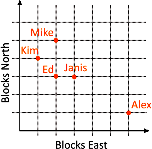
The process to create a scatter plot is rather simple, just think of each variable as a coordinate that will allow you to locate a point in a graph. Does this make sense? Just in case, let us look at a table containing a bivariate set of data which happens to use the principles of coordinates as variables:
For this example, lets say you have five friends, and all of them live in the northeast direction when taking your house as the point of reference. You are trying to find out how far away (in units of blocks) each of your friends lives from your home; therefore, the two variables in question are number of blocks to the East from your house, and number of blocks to the North from your house, the data table looks as follows:
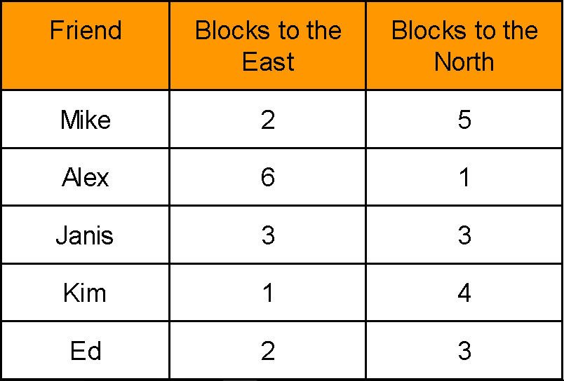
Following the scatter plot definition and description we have learnt, we obtain the following scatter plot for the table above:
• What is correlation?
Correlation can be positive, negative, zero (or no correlation) and curvilinear. In the next figure you can see an example of the three most common types of data correlation:
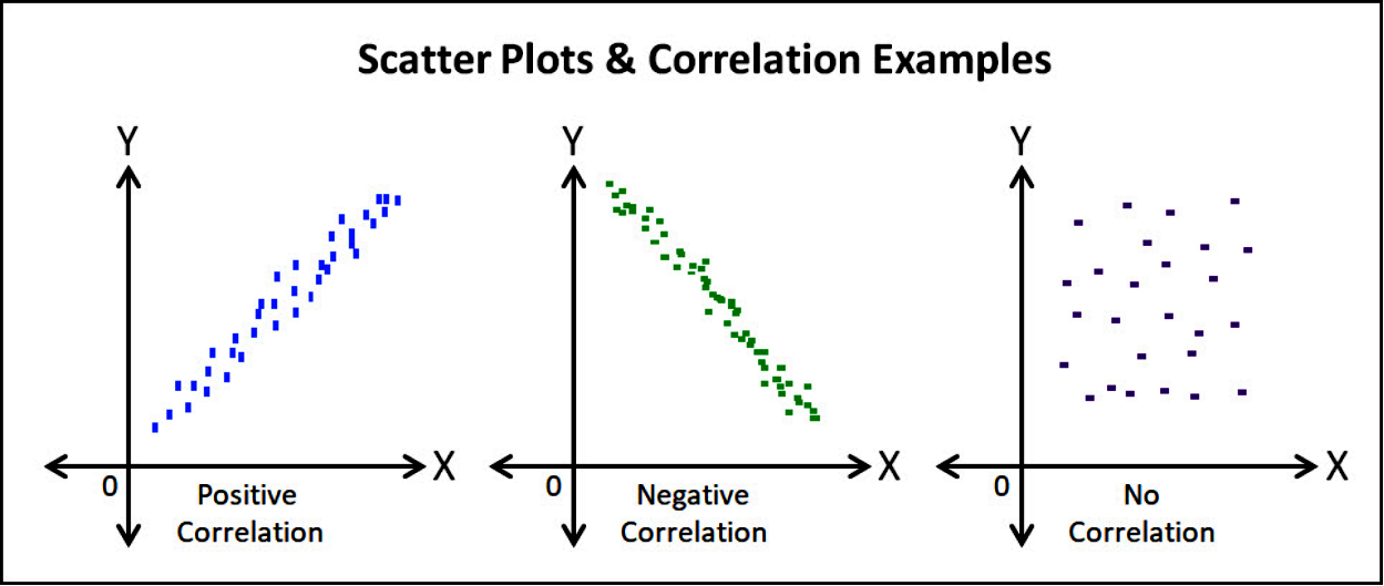
To explain the three main types of correlation of the variables in a bivariate data set we have that:
- If the value of the data points increase for the variable in the horizontal axis, just as it increases for the variable in the vertical axis, then it is said the two variables have a positive correlation.
- If the value of the data points increase for the variable in the horizontal axis, just as it decreases for the variable in the vertical axis (or vice versa), then it is said the two variables have a negative correlation.
- When no relationship or tendency is seen between the two variables, we say there is no correlation between them.
A positive and negative correlation are types of linear correlations, and the strength of them is measured by a value known as the correlation coefficient ():
When the correlation coefficient is negative, the bivariate variables have a negative correlation (one increases while the other decreases). When the correlation coefficient is positive, the bivariate variables have a positive correlation (one increases as the other increases too).
Now that you know the bivariate data definition, how to plot it in a scatter plot and how its variables correlate, it is time to take a look into a few example exercises.
Bivariate data set examples
On this section we will take a look into a few examples of bivariate data and their corresponding scatter plots and correlations, to answer a few questions of the sets provided.
Example 1
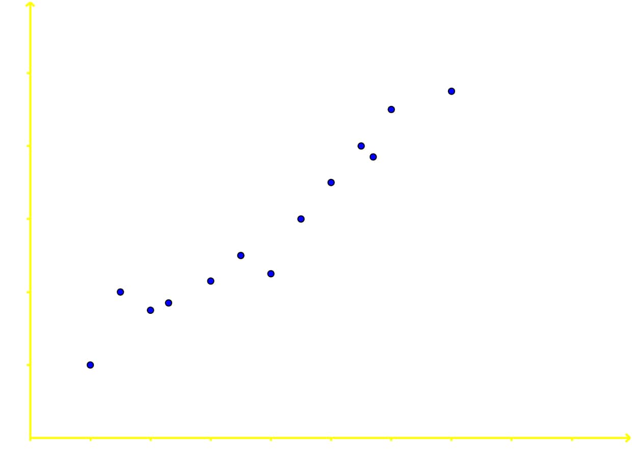
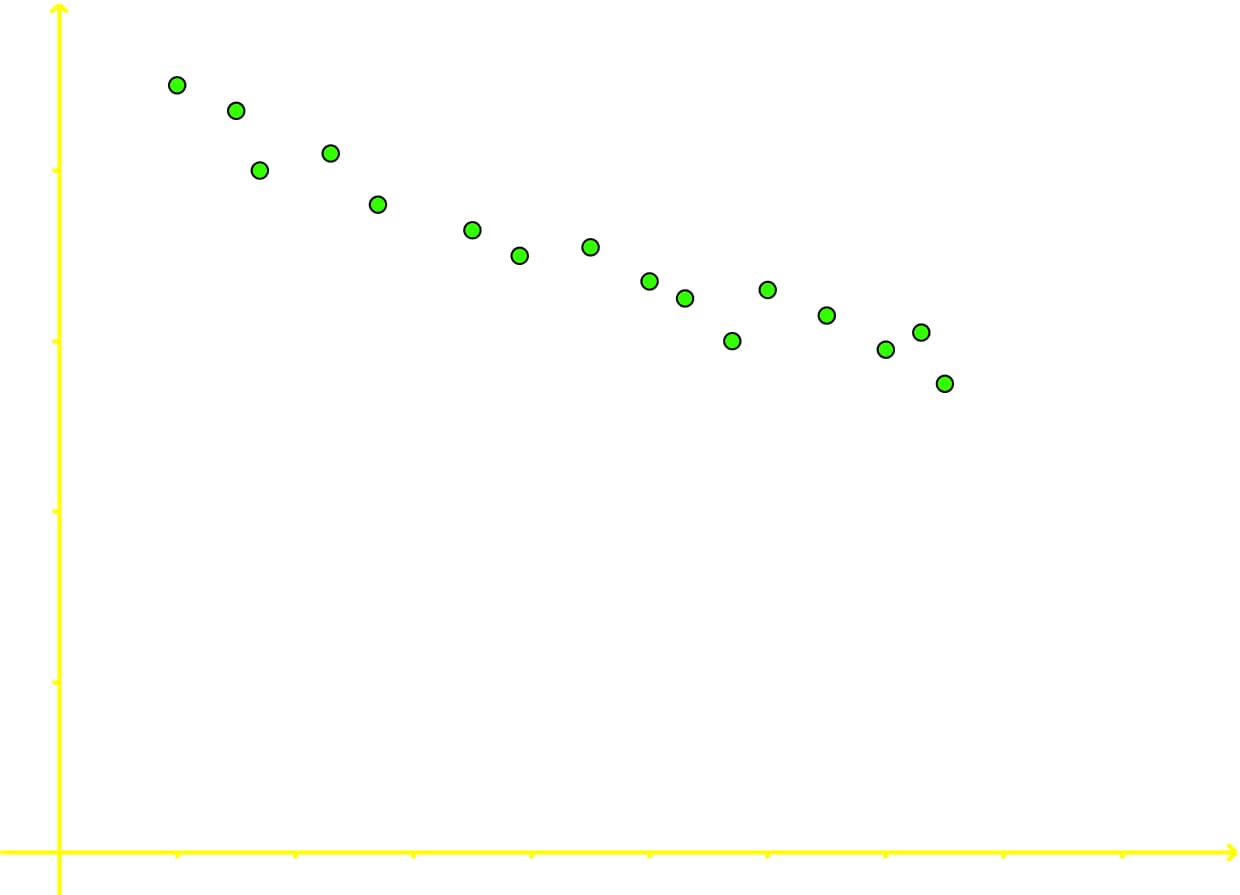
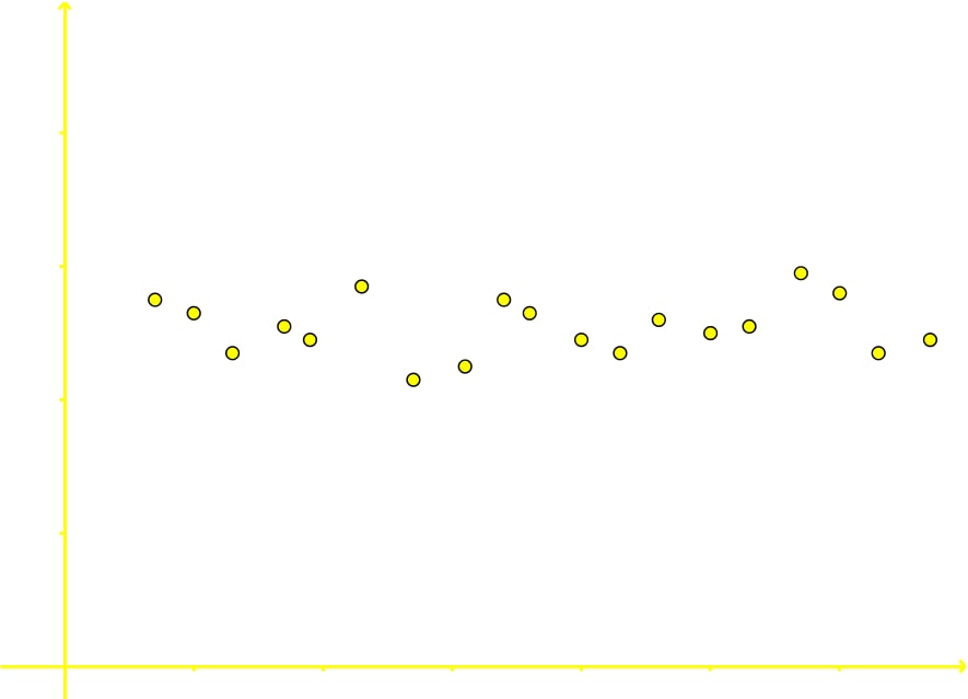
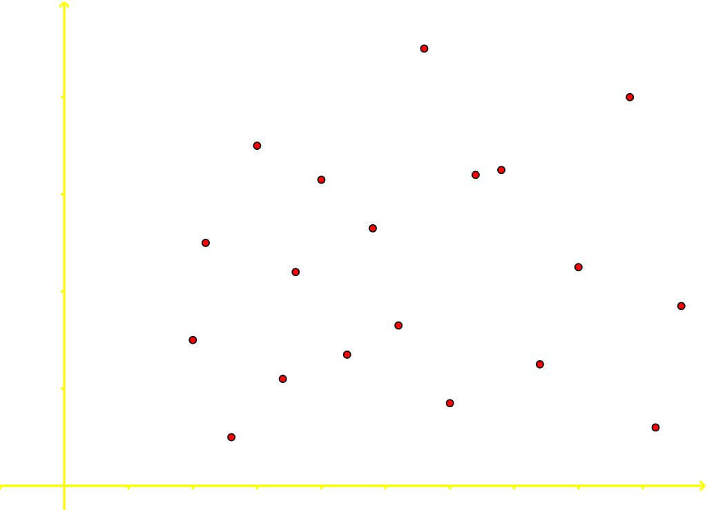
Determining CorrelationFor each of the following scatter plots determine whether the bivariate data is positively correlated, negatively correlated, or has no correlation.
a)
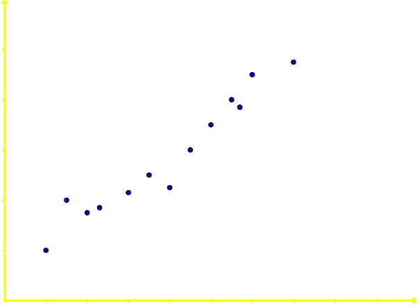
The two variables in this scatter plot are positively correlated. Although after looking at figure 4 this is easily seen, it is important we explain a little bit of the reason behind the answer: Notice each data point as its going towards the right (the increase direction for the variable in the horizontal axis) is also going towards the top (which is the increase direction of the variable in the vertical axis); therefore, each dot is continuously increasing its value in both variables, producing an overall increasing tendency or positive correlation.
b)
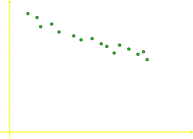
The two variables in this scatter plot graph are negatively correlated. Once more, although this is easily deduced from looking at figure 4, it is important to explain the reason behind the answer: Notice each data point as its going towards the right (the increase direction for the variable in the horizontal axis) is also going towards the bottom (which is the decrease direction of the variable in the vertical axis); therefore, each dot is increasing its value according to the variable on the horizontal axis as its decreasing in value for the variable on the vertical axis. Increasing in one side while decreasing on the other produces a negative correlation.
c)
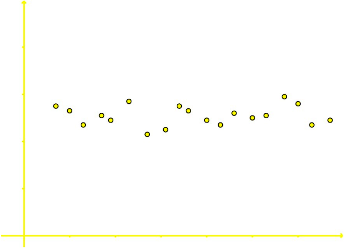
The variables on this scatter plot have no correlation with each other since the data is scattered in a general tendency with a zero slope, meaning, they do not show signs of significantly increasing or decreasing for at least one of the variables (in this case for the variable in the vertical axis, notice how the dots go up and down seemingly randomly).
Therefore, there is no correlation.
d)
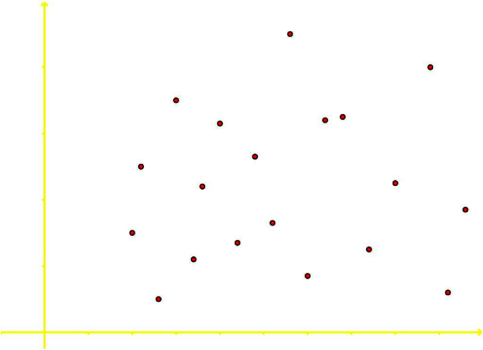
Again, the data points on this scatter plot show no signs of correlation due to the lack of a general tendency to the data. Just as the data points go up and down for one variable, they do the same for the other; therefore, there is no correlation among these two variables.
Example 2
State whether each of the following bivariate data will most likely be positively correlated, negatively correlated or have no correlation:a) Amount of gas put into a cars gas tank and the distance that car will travel
Notice the first variable for this case is the amount of gas put into a cars gas tank ( not the level of gas in the cars tank) versus the distance that the car will travel. For that matter, since a car needs gasoline to run, the car will cover a certain amount of kilometers per each litre of gasoline spent depending on the efficiency of the cars engine. Therefore, the more gasoline is put into the tank, the more distance the car will be able to cover with it, and so, these two variables are positively correlated.
On the other hand, if the first variable of this question was the level of gas in the cars tank, the situation would be quite different. A car spends gasoline as it runs; therefore, as the driver accumulates more distance traveled, the car is spending more and more gas until a certain point when its tank is emptied. Since one variable is increasing in value while the other one is decreasing, these two variables would be negatively correlated to each other.
b) Amount of cigarettes smoked and your life expectancy Just as before, one variable is decreasing one other one is increasing in this case since the life expectancy of a person goes down as more cigarettes have been smoked by the person (due to the accumulation of about 7000 different chemicals in your body, some of them carcinogens).
Therefore, these two variables have a negative correlation with each other.
c) The amount of time you spend watching TV and the price of rice in China The two variables in this case have no relation to each other whatsoever, they produce no effect on one another in any way; therefore, there is no correlation between the amount of time you watch TV and the price of rice in China.
This is it for our lesson of today, see you in the next one!
• Bivariate data is data that has two variables
• Scatter Plots are a graphical representation of two different data sets
• Scatter Plots are a graphical representation of two different data sets

